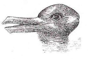
- Image via Wikipedia
In which you learn why Marlena has so woefully neglected her blog.
What a heavy, freaking year it’s been. Considering that I moved to a different hemisphere, that’s no surprise, but I’m not even talking about the move itself. One of my goals for the year that I don’t think I ever articulated even to myself was that I wanted to work on a paradigm shift for my own approach to visualizing data. My effort to write a treemap application in Processing with Java was the last straw. I guess my experiments with Erlang and Scheme corrupted me. They showed me that there is a way to break free of the loops within loops with loops. Aside from language choice, I had a “Gone with the Wind” moment of deciding that I would never use a spreadsheet as part of a visualization process again. I don’t want to be stuck with static data forever. It’s time to get closer to working with real time feeds as they are the best way to suck in extremely large amounts of data. The sum total of these decisions has been a year spent building new skills. I’ve learned how difficult that can be in the midst of new job that requires my full attention, growing Weekend Testing in my new corner of the planet and enduring my husband’s experiments with Australian cuisine (He doesn’t read my “nerdy” blog, so don’t y’all tell him I said that.)
Part I of the Epic Visualization Quest: A language (or two)
For most of this year, I’ve been on a quest for a new language. I tried on Python and attended Pycon which happened to take place in Atlanta a couple of weeks before I moved. I’ve done a lot of work with ruby which felt more comfortable for me than python (who knows why, I certainly can’t explain these things.) At the end of the year, I started learning javascript. When I predicted, at the beginning of 2010, that functional programming would show up on my doorstep, I had NO idea that javascript is a highly functional language. This really hit me hard when I sat down to write a javascript program with a colleague of mine and we both stared at the screen for 5 minutes before uttering a bunch of sentence fragments that went something like, “well you need a class…” (ain’t no classes in javascript.)
I’m a fan of not just learning a language, but of understanding the headspace of that language. This makes it harder to get started, but ultimately means that I won’t be trying to force java concepts that don’t belong into a javascript program. I’ve also tried to understand which parts of javascript I might not want to use. David Burns, The Automated Tester, suggested I give Douglas Crockford’s Javascript: The Good Parts, a read. I’m halfway through, and while it’s not as hands on as some programming books I’ve read, it’s showing me the headspace I should be in to take better advantage of what JS has to offer. It’s taking me some time, but I have more confidence that what I write will be better code.
Part 2 of the Epic Visualization Quest: Data Access
Most of the experiments I’ve done with data viz have involved spreadsheets, comma delimited data or tab delimited data. I’m completely over using all three. I can’t tell you how much time I spent schlepping data files from application to application in order to get my data in good enough shape to import into a visualization app. Since the files were usually pretty big this turned into going and getting some coffee while Excel would open the file. It was SO annoying. When I attended the Writing About Testing conference in May, Chris McMahon did a short presentation on REST and it opened my eyes. Over the rest of the year, I gradually built up my knowledge of REST and JSON which culminated in an example Ruby script you can use to pull data from JIRA, the Atlassian Issue tracker.
Part 3 of the Epic Visualization Quest: A Visualization Library
Just as important as choosing a language is choosing a graphics library. The 2 major libraries used with javascript, specifically for data visualization are Processing.js and Protovis. Previously, I’ve worked my way through all of the examples in Ben Fry’s “Visualizing Data.” This was the book that initially introduced me to data visualization and convinced me that I needed to read everything by Edward Tufte. Since Ben Fry is one of the creators of the processing language, the code in the book is processing and java. This makes processing.js a no-brainer, but then I took a look at protovis. I’m so intrigued with their example of a parallel coordinate plot that I have to give it a try. I also think that their syntax will be slightly easier to use.
This has been a lot of change on top of change to digest and it’s made the year frustrating. I am still horrible at writing javascript, but I’m also determined to be patient. Good visualization takes time. It is all about details and refinement which requires patience. This patience means that my blog will probably continue to suffer but I’m hoping it also means I’ll have my visualization stack in order which will lead to better focus for 2011.
Btw…next Weekend Testing is on Sunday, January 23. This month we’ll be pushing further into critical thinking.
