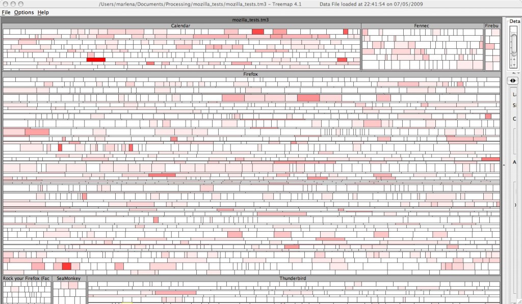
Yes, that really is 3859 tests in a treemap. The size of each square represents the number of tests and the color represents the number of failures out of 1 -15 tests. I used the strip layout to preserve order which means that anyware you see a cluster of red indicates consecutive tests with several failures.
There’s much room for improvement with this one, but the complexity of wrangling this data into the tm3 format forced me to make compromises. For starters, the hierarchy is missing a layer. I had to leave it out because it would have duplicated tests, and I wasn’t sure how I felt about that. Although the number of failed tests does show tests that have had more failing runs, what it doesn’t show is how these tests are grouped by OS. I want to see failures grouped by OS, and plan to work on this. Instead of showing number of failed tests, I think it would be more truthful to show a failure rate. That is, given the number of test runs for that test, what is the percentage of fails.
It’s late, and the Art Wolfe show has finished on PBS. Oh crap, it’s Sherlock Holmes with Jeremy Brett. I think Jeremy Brett is awesome. If I don’t go to bed now, I’ll be up ’til 12. Please forgive any crazyness in my post this time. I’m just a little giddy about actually seeing this.

This is very cool! I Have been wanting to do this with test case results.
I also thought it would be cool if you could some how color the boundary of the square with the probability that the test would fail based on previous tests. I will let you know if I figure anything out.