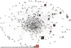
- Image by Marc_Smith via Flickr
Disclosure: I wrote this in February, but never posted it. It’s one of those pieces I just sort of coughed up in 10 minutes and forgot about. This past week, I’ve been rolling around in semantic web concepts. I feel like writing about them but don’t want to leave y’all wondering what I’m talking about.
Twitter has become such a part of my professional life. It’s also extremely difficult to filter. Everyone who uses twitter has some algorithm for deciding when to follow, not follow or unfollow someone.
Since my blog template now includes the nifty little blue button up there in the top left corner, I’ve been getting followers from my blog. If this is how you decided to follow me on twitter…welcome to the party :)
Currently, when someone follows me on twitter, I have to go through a really awful, dis-combobulated process of deciding 1) are they a spammer? 2)should I follow them back. The process of having to figure these 2 is one manifestation that our regularly scheduled internetz is not working anymore. We need the semantic web and we need it now. We need data visualization and we need it now. We need the two to work together like peanut butter and chocolate and we needed it yesterday.
The Semantic Web:
I always link to this youTube of Sir Tim Berners-Lee. It’s for a reason, so if you haven’t watched yet, please have a look (I just watched it again). It is the vision of the semantic web. The reason why this particular problem can, I believe, only be solved by a semantic search is because judging someone on twitter is so freaking hard. It’s not just who they know. It’s about their interests, it’s about what they are working on, it’s about how much they tweet and what they tweet about.
I am a tester, but I follow developers too. I enjoy following testers who are local but I also enjoy following testers who live in other parts of the world. I’ve got a few friends on twitter who I know in real life. The only celebrities I currently follow are celeb-u-testers, but I won’t embarrass them by calling them out here. In fact, there’s one guy I follow just because he’s an uber-nerd who is always tweeting about uber-nerd types of things. Much of it is over my head, but I find it’s a great way to keep my eye on the pulse of tech emanating San Francisco.
What do these people have in common? Maybe some of them have a few things in common, some of them have a lot in common and some of them have nothing in common with each other but there is something about them that interests me.
Data visualization
At this point a network visualization would really be helpful. If you’ve ever looked at a family tree, that is very similar to a network graph. Network graphs are all about showing and judging relationships.
A love match:
In this case, when I am notified of a new follower on twitter, I would really like to see that person’s network graph in relation to my own. However, and this is where it gets interesting, I don’t want the network graph to ONLY consist of people. I don’t just want to see who, I want to see why. Do people work in the same place? Do we share an interest in a computer language even if I am a tester and the other person is dev? Were we both residents of Haus Berlin in Wuerzburg, Germany from Fall 1994 to Summer 1995? Does this person tweet when their nose hairs grow an inch (which, btw, is a really gross thing to tweet ) or do they only ever tweet when they write a new blog post? (In which case they are probably already in my reader so I don’t need to follow them either.)
The 17 twitter visualizations summarized by Nathan Yau on his Flowing Data blog dance all around the big picture of visualizing twitter. Most of them show network relationships between people, some of them show locality, some show the volume of tweets per hashtag, but none of them has found a way to integrate all of this information. The team that accomplishes this will be making a huge breakthrough.
This is a new level of complexity for me, and I’m guessing, many others as well. Unfortunately, these are not problems that can be solved with an email and a pie chart. I’ve started working on using pieces that go into a semantic web application. I’ve done this partly because I feel there is promise for testing here. If you see me posting about non-testy stuff like REST or RDF or data.gov.uk, it’s because these are my attempts to fully understand how I can engage semantic web concepts for testing. Exploratory testing through exploratory data analysis: bring it!
![Reblog this post [with Zemanta]](http://img.zemanta.com/reblog_e.png?x-id=357d0218-9414-424a-b9ef-d9797b045a8b)
1 thought on “Putting Pieces Together: The Semantic Web & Data Visualization”
Comments are closed.