Visualizing Defect Percentages with Parallel Sets

Prof. Robert Kosara’s visualization tool, Parallel Sets (Parsets) fascinates me. If you download it and play with the sample datasets, you will likely be fascinated as well. It shows aggregations of categorical data in an interactive way.

I am so enamored with this tool, in particular, because it hits the sweet spot between beauty and utility. I’m a real fan of abstract and performance art. I love crazy paintings, sculptures and whatnot that force you to question their very existence. This is art that walks the line between brilliant and senseless.

When I look at the visualizations by Parsets, I’m inclined to print them off and stick them on my cube wall just because they’re “purty.” However, they are also quite utilitarian as every visualization should be. I’m going to show you how by using an example set of defects. Linda Wilkinson’s post last week was the inspiration for this. You can get some of the metrics she talks about in her post with this tool.

For my example, I created a dataset for a fictitious system under test (SUT). The SUT has defects broken down by operating system (Mac or Windows), who reported them (client or QA) and which part of the system they affect (UI, JRE, Database, Http, Xerces, SOAP).

Keeping in mind that I faked this data, here is the format:

DefectID,Reported By,OS,Application Component
Defect1,QA,MacOSX,SOAP
Defect2,Client,Windows,UI
Defect3,Client,MacOSX,Database

The import process is pretty simple. I click a button, choose my csv file, it’s imported. More info on the operation of Parsets is here. A warning: I did have to revert back to version 2.0. Maybe Prof. Kosara could be convinced to allow downloads of 2.0.

I had to check and recheck the boxes on the left to get the data into the order I wanted. Here is what I got:

See the highlighted defect.

So who wants to show me their piechart that they think is perfectly capable of showing this??? Oh wait, PIE CHARTS WON’T DO THIS.  Pie Charts can only show you one variable.  This one has 4.

This is very similar to the parallel coordinate plot described by Stephen Few in Now You See It and shows Wilkinson’s example of analyzing who has reported defects. She was showing how to calculate a percentage for defects.  See how the QA at the top is highlighted?  There’s your percentage.  Aside from who has reported the defects, Parsets makes it incredibly easy to see which OS has more defects and how the defects are spread out among the components.  If I had more time, I would add a severity level to each defect.  Wouldn’t that tell a story.

Parallel Sets is highly interactive.  I can reorder the categories by checking and unchecking boxes.  I can remove a category by unchecking a box if I wish.

I took away the individual defects.

By moving the mouse around, I can highlight and trace data points.  Here I see that Defect 205 is a database defect for Mac OS X.  Although I didn’t do it here, I bet that I could merge the Defect ID with a Defect Description and see both in the mouse over.

See the highlighted defect.

Parallel Sets is still pretty young, but is just so promising.  I’m hoping that eventually, it will be viewable in a browser and easier to share.  Visualizations like this one keep me engaged while providing me with useful information for exploratory analysis.  That’s the promise of data viz, and Parallel Sets delivers.

Underpants Gnomes Among Us: Exploratory Analysis for Visualization and Testing

Here’s a picture of tester dog, Laika, with Dr. James Whittaker’s new book, Exploratory Software Testing: Tips, Tricks, Tours, and Techniques to Guide Test Design. It showed up on my doorstep last week, and is my first free testing book ever (thanks Dr. Whittaker!)

i can haz testr buk.
Tester Dog

In reading through Stephen Few’s new book, Now You See It,I came across a completely separate perspective of looking at graphics in an “exploratory” manner. I can literally hold a book preaching the value of “exploratory testing” in one hand and a book preaching the value of “exploratory analysis” in the other. They are the same concept. If you have ever wondered what interdisciplinary means, this is a great example of an interdisciplinary concept.

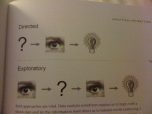
Stephen Few does a great job of explaining exploratory analysis with pictures:

where's the profit?
Exploratory Analysis

Half of the people reading this now understand the underpants gnome tie-in. For those who don’t get it, here’s a link to the original South Park clip (NSFW).

Jokes aside, I’m going to start with the picture, and discuss what this says to me about testing and see if it meshes with what JW’s definition of exploratory testing. I will then look at how this applies to visualization. At the end, the two will either come together or not. At this point, I’m not sure if they will. I’ll just have to keep exploring until I have an answer or a comment telling me why my answer is crap (which is fine with me if you have a good point).

Starting with the picture and testing. I’m assuming the “?” means “write tests.” The eyeball means analyze. The light bulb is the decision of pass or fail. The illustration of directed analysis looks like the process HP Quality Center assumes. QC assumes you’ve primarily written tests and test steps before testing based on written requirements. Then you test. After you’ve tested, you have an outcome.

The second line for “exploratory” analysis looks like a much more cognitive and iterative process. This says that the tester has the opportunity to interact with the system-under-test (SUT) before formulating any tests(eyeball). After playing with the SUT, the tester pokes it with a few tests (“?”). At this point the tester may decide some stuff works and keep poking or decide that some stuff has failed and write defects(light bulb.) Chapter 2 of Exploratory Testing describes how JW defines exploratory testing: “Testers may interact with the application in whatever way they want and use the information the application provides to react, change course and generally explore the application’s functionality without restraint (16).” So far this is looking very similar.

Now that I’ve looked at how the exploratory analysis paradigm applies to testing, here’s how it applies to visualization. As an example visualization, I’m looking at a New York Times graphic, How Different Groups Spend their Day. When I open this graphic, I can see that it’s interactive, so I immediately slide my mouse across the screen. I notice the tool tips. Reading these gets me started reading the labels and eventually the description at the top. Then I start clicking. The boxes on the top right act as a filter. There is a also a filter that engages when a particular layer is clicked.

Few’s point in describing directed analysis vs. exploratory analysis is that in the wild, when we look at visualizations, we use exploratory analysis. It’s not like I knew what I was going to see before I opened the visualization. Few describes the process known as “Schneiderman’s mantra” (for Ben Schneiderman of treemap fame) in more detail saying that we make an overall assessment (eyeball), take a few specific actions (“?”), then reassess (eyeball). Although Few doesn’t say that there is a decision made at some point in this process, I’m assuming there is because of the light bulb in the picture (84).

Recently, Stephen Few asked for industry examples of people using visualization to do their work. Some of the replies were from the airline industry, a mail order warehouse and a medical center. Software engineers should be included in this mix and apparently from page 130 in JW’s book showing a treemap of Vista code complexity, already are. Given that both use the same form of exploratory analysis, I can see why.

Exploratory analysis of software testing and visualization diverge, however, when you look at the scale of data for which each is effective. Visualization requires a large dataset. This could be multiple runs of a set of tests or, as in JW’s example, analysis of large amounts of source code. Exploratory testing as JW describes can occur at a high level such as in the case of a visualization or at the level of an individual test.

One thing my exercise has shown me for sure is that I have to read more of Exploratory Testing.

Training without a Net

Trapeze School New York Beantown at Jordan's F...
Image by StarrGazr via Flickr

Those of us who like to be actively involved in the meetings we attend surely notice the effect a giant flat screen presentation has on meeting conversation.  It can be stultifying.  In the case of training, the presence of slides on a flat screen is the equivalent of showing a really bad talk show like Jerry Springer.  Nobody learns or remembers anything unless there is a fight or petty squabble.

This week I had to train some of our system’s users on how to write usable bug reports.  I had an outline and an example that I thought was interesting enough to keep people awake and focused on the topic. In order to make the information stick, I decided to go without slides, and see what it got me.

Preparation
You would think there would be less to prepare, but in truth, you have to come up with something that will keep your audience occupied.  In my case, I put together a group exercise by creating a scenario involving a bug.

Tip #1: don’t create a trivial scenario

My scenario was too far removed from our daily situation to ring true.  I could tell that some of the users felt I was wasting their time by having them work with an example they felt was “too simple.”  Once I noticed this, I threw it out and said, “let’s just talk in terms of our system.”  This seemed to make people more comfortable.

Tip #2: have an outline IN REALLY BIG LETTERS
Chris McMahon suggested this over twitter (thx!) and it did help.  The only problem with my outline, is that I couldn’t see it very well without picking it up.  There wasn’t much on it anyway so if I could have easily enlarged the font.

Keeping Your Audience Awake
Chris also suggested that I move around and stay animated. Since I have natural talent as a drama queen, this is typically not a problem for me, but is worth a mention. Raise your hand if you’ve seen a speaker able to put you to sleep merely with the narcoleptic power of their voice. There are also speakers who mumble in which case you won’t be able to understand what they are saying even if their voice keeps you awake because its “nails on a blackboard.” In that case, maybe you really do need the slides. Am I getting too off-topic with this?

Keeping the Focus on Topic
Once the flat screen has been removed, you will find that people have stuff they want to get off of their chest.  If you are the only person holding meetings without slides:  Guess what?   They will choose your meeting to unload.  I noticed people communicating more about our defect process than I had anticipated, and not necessarily in ways that I had planned.

Tip #3 Be flexible and open to some change in the agenda
Mid-way through our exercise, we had chucked my example and were discussing the pieces of our system that should be documented in describing the environment of a crash.  The users were talking to developers about the challenges they have in reporting their environment and I noticed some holes in our defect process. We were still on topic, but I let the users talk to us about what they typically see when they have problems running the system.

Tip #4  Don’t let meeting participants change your whole agenda
Since people were talking to each other and sharing information about our software process, the discussion was pretty intense.  I found myself circling back to my outline a number of times.  Some discussion was worthwhile, but obviously needed to happen in a separate meeting.  Sometimes attendees will resist moving on, but I find that a quick, “we’ll schedule another meeting, moving on to <next point goes here>…” will get the job done.

Would I do this again?
Absolutely.  Even though I write about and study visualization, there are times when we really do need to sit in a circle with the talking stick and communicate with each other.  In fact, even Prof. Edward Tufte recognizes that there’s no need to have the monitor on all the time.  In his lectures, he shows you the graphic, tells you what to look at and then TURNS IT OFF.

Training without slides is not for the faint of heart, but, in the end, I think my work colleagues respected the fact that I wanted them thinking through the material and not just gaping at a flat screen.

Reblog this post [with Zemanta]

Plagues aren’t just for blog posts

Vibrio cholerae with a Leifson flagella stain ...
Image via Wikipedia

For the past couple of months, James Whittaker has been writing about the “plagues of testing.” As he’s been posting, I’ve been reading through a book about a real plague.

As software testers, we see a system from a perspective that developers and business types rarely and may never see.  We know our tests, we know how well they ran.  We know our system under test and which components are picky.  If you are like me, and have access to the code base, you also know the code.  In the case of both the system and it’s code you know what should be better.  Sometimes this is not a big deal, but sometimes it is a warning that it’s time to polish the resume. I have not seen this, personally, but I know that there are testers who find themselves in this position.

John Snow was a doctor in this position. He was an expert in the new art of anesthesiology in 1850’s London. He was also deeply involved in the study of cholera and concluded that it was a water born illness. This was very much counter to the prevailing theory of the time that cholera was passed through a sheer volume of stench or miasma (I can hear Dr. Evil saying this word). Health authorities in London, were so convinced that miasma, or extreme smellyness, was the reason for disease that they passed a law in 1848 requiring Londoners to drain their waste into a sewage system that would deposit into the Thames river. Unfortunately, the Thames was also a main source of drinking water for the city. Snow knew all of this and could see a health crisis in the making.

In 1854 when a major outbreak of cholera erupted in a neighborhood very close to where Snow lived, he conducted a thorough investigation in order to prove this theory that cholera was passed through water. He had a list that detailed the names and addresses of 83 people who had died from cholera.  He also had an invaluable resource of detailed information about the neighborhood’s residents in the form of local clergyman Henry Whitehead.  While Whitehead tracked down and questioned everyone he possibly could about their drinking habits, Snow analyzed this data to form patterns of who had been drinking the water, who had died and, just as importantly, who had NOT died.  Not only were Snow and Whitehead able to convince the local parish board to remove the handle of a contaminated water pump, they knew their data so well that they were able to figure out the index, or original, case that had started the outbreak.

John Snow Map

After the outbreak had subsided, Snow put the analysis from his investigation together with a very famous map into a monograph that circulated among London’s health professionals.  His monograph slowly but effectively turned the tide of thinking among health professionals away from the miasma theory.  This and a very smelly Thames convinced authorities to build a new sewer system that drained into the sea.

Frequently, when I talk to people about data visualization, they always ask me how I know what to visualize.  The Ghost Map, by Steven Johnson, illustrates this perfectly.  John Snow went from having a theory to proving his theory with visualization in a convincing way.  There’s no wizard or easy-button for this one.  It takes knowing what you are trying to say and knowing the data, inside and out, you are using to prove your theory.  For testers, this means digging into test runs and testcase organization.  Where are the tests that failed?  How many times did they fail? How are they grouped together?  Does an object that make 1 test fail make others fail as well?  If you know which tests are failing, what do you know about the code you were excercising?  How complex is it?  I know this awful, but I would so go here if I thought it made a difference…who coded it and do I respect their coding talent? Even if I think they are solid, did they know what they were supposed to be doing? You have to know exactly why you are telling the PM you think there is a serious problem and have a way to show it. I lump business people in with having the same short attention span as doctors and politicians. My blog post probably lost them at “James Whittaker.”

Johnson and Whitehead could not drag the dead people’s relatives in front of London’s public health community and force the doctors to listen.  These days doctor’s short attention span is because of insurance, but I’m sure there were other reasons back in the day.  A good visualization does not take a long time for the viewer to process.  That is their special power.  Snow’s map is much more concise than a table of 83 names and addresses along with their individual stories.  Visualization can quickly show your groups of tests that are failing.  It can show that severe defects are increasing, and not decreasing, over time.  Business may drive the ship/do not ship decision, but a good tester will know why a seriously ailing system is in so much trouble.  A great tester can effectively communicate this to a business team.

Reblog this post [with Zemanta]

Testing in a Throwaway Culture

Picture of a Caterpillar 826C landfill compact...
Image via Wikipedia

When was the last time that a prized possession of yours broke before its time? Did it make you angry and disappointed?  Were you surprised or were you half-expecting it to break?

Craftsmanship is a word we no longer associate with many of the things that come into our possession.  This was brought to my attention recently when I had to buy a new motor for my very pricey KitchenAid, Architect II dishwasher.  As software quality professionals, we are all on the other side of this.  How many tests were you able to run?  How well did you really vet that app?  Did you understand the app?  How much of your testing went according to plan, however much planning you had?  Did the plan really matter anyway?

Last week, a good friend of mine wrote about his frustration at not having enough time to execute tests because of other test activities such as shaking out requirements, managing others, etc.  I kind of know how he feels because, as the test army of 1, I am responsible for many of the same activities.  I’ve done all sorts of reports and activities that will pad my resume as a QA resource, but, in the end, this is not why I do the job that I do.

Here is a post from Chris McMahon’s blog that is, in contrast, ALL ABOUT why I am very content as a technical QA.  The utter hack-itude of the exploits described in this post are exactly the domain of the tester I try to be every day.  But then, I have the bug reports to fill out, the test planning to create and the inevitable smoothing over of dev ego.  These things slowly but surely chip away at my day.   My friends blog is a description of how, for more senior test professionals, it becomes their whole job, and my friend isn’t the only tester I’ve noticed lately opining the strategy tasks that take up their time ( you know who you are).

We live in a throwaway culture where breadth is valued way over and above depth, and it seems, to me, that this can heavily influence our careers, sometimes for better and sometimes for worse.  This includes software development AND QA.  I’ve worked in this type of environment, not as a tester, as a CM.  I noticed that for every role, CM, tester or dev as soon as people became technical experts at what they were doing, they were expected to start managing whether they wanted to or not, whether they made a good manager or not.  Am I right or am I right?  What’s missing here is an association depth with value both on the technical side and the management side.

What does this mean, specifically, for testing?  What does it mean to be an expert craftsman in testing?  Does it mean that I can switchblade an app with heuristics, any time, any place? Or does it mean that I will find a way to make some assessment of quality if given the most mountainous of systems to test in extremely adverse conditions?  My personal goal is to work hard at both.  I use test management activities mainly as a way to manage DRY (do not repeat yourself) and to get on with the tests.  It’s almost as if there is a sliding scale with test execution at one end and management of test activity at the other end.  This seems a rather one dimensional approach, and careers are not one-dimensional.

When you are asked to stop testing so much and to start managing more, what will you say?  Are you ready to give up depth as a tester and increase your breadth as a manager?  Is this really a one-dimensional issue?  For some, and maybe even for me at some point, this can be a great decision.  In some places, maybe there is less of a tradeoff than what I’ve seen.  For some, participating more in the management process might mean better quality for an entire team.  If the entire team improves, maybe the software will break less.  If the team is testing KitchenAid dishwashers, maybe the dishwashers will break less, and I won’t have buyer’s remorse for my fancy kitchen appliances.

Love it? Hate it?  Comments are always welcome.

Reblog this post [with Zemanta]

Submitted an Abstract to PNSQC

I’m posting the abstract I just submitted to PNSQC. It’s also the abstract of the thesis I’m writing for my Masters. I’ve submitted a poster to the Grace Hopper Conference, but never before have I submitted a full-on paper requiring a full-on presentation. I chose PNSQC for 2 reasons: the focus is more on the practical side, unlike some of the ACM conferences and the conference is in Portland, Oregon. God, I love Portland.

Anyway, here is what I submitted:

Visualizing Software Quality

Moving quality forward will require better methods of assessing quality more quickly for large software systems. Assessing how much to test a software application is consistently a challenge for software testers especially when requirements are less than clear and deadlines are constrained.

For my graduate research and my job as a software tester, I have been looking at how visualization can benefit software testing. In assessing the quality of large-scale software systems, data visualization can be used as an aid. Visualizations can show complexity in a system, coverage of system or unit tests, where tests are passing vs. failing and which areas of a system contain the most frequent and severe defects.

In order to create visualizations for testing with a high level of utility and trustworthiness, I studied the principles of good data visualizations vs. visualizations with compromised integrity. Reading about these lead me to change some of the graphs that I had been using for my qa assessment and to adopt newer types of visualizations such as treemaps to show me where I should be testing and which areas of source code are more likely to have defects.

This paper will describe the principles of visualization I have been using, the visualizations I have created and how they are used as well as anecdotal evidence of their effectiveness for testing.

First Attempt at Visualizing Tests and Defects

This post is about a visualization I created to show test execution status with related defects using data obtained from HP Quality Center. I’m using Excel to create this chart and deliberately stayed away from “fancy tricks.” If you want to recreate this some steps will be different if you don’t use Quality Center or Excel. In that case, you get to figure it out.

My weekly status meeting drove me to create this chart. Every week, I sit in this meeting with some pretty important people. Whenever I’m in a testing phase, I have to show what it is I’ve been working on. Previously, I’ve used the report templates from Quality Center, but they really are crap. Wait, that’s not big enough…They really are C-R-A-P. Not only is it difficult to jostle the correct data into place, but they are ugly and none of my superiors actually trusts the Quality Center visual. Since I’ve been doing all this reading about data viz, I realized that I could easily create something much better using Excel in less time.

There are several steps to creating any visualization, and I’ll break down the creation of this chart into the following steps. They are from Ben Fry’s excellent book, Visualizing Data: Exploring and Explaining Data with the Processing Environment.
Acquire – getting your data
Parse – structuring, and sorting your data
Filter – remove stuff you don’t need from your data
Mine – apply mathemagic in the form of statistics, data mining, whatever to show patterns in your data
Represent – choose the type of graph or chart you will be using
Refine – polish your chart so that it has clarity and makes people want to look at it
Interact – add ways for the user to explore your chart

Acquire
Looking at your test set in quality center’s test lab, right click, and QC will show you an option at the bottom for “save as.” Click and this and choose excel sheet. Html would work too since excel can parse through QC’s html.

Parse
For this chart, I like to create 3 groupings: passed, failed and no run. You can have other groupings, but you probably want to make sure that the “other” groupings are together. In Excel, I sort the data by status into the 3 groups. If you are using a test set from the past, you might only have 2 groupings.

Filter
This will change depending on how large your team is and how the work is divided. Since I’m the only tester, we all know who executed the tests in my chart. I remove the columns for Attachment, Planned Host, Responsible Tester, Execution Date, Time and Subject. This leaves only 2 columns, Test Name and Status.

Mine
No mining in this one, it’s just straight up data.

Represent
This chart will be using a stacked bar format which looks similar to a stemplot, but isn’t really a stemplot.

Refine
Here’s where the magic is really happening. See that column for status? Add a column between “Test Name” and “Status.” Each cell in the new column gets a color according to that test’s status: Passed=green, Failed=red, No Run and anything else is gray. If you use the basic colors in Excel, your colors will be too bright. In Excel 2003 you can change this by navigating to Tools>Options>Colors. Here you can choose some less saturated versions of red and green. You’ll still need the very bright red, so don’t save another color over it.

Use fill color to change the colors in the empty column next to the status column. Now you can see each test and you can see how much is passed and how much is failed. Since the status is now indicated by color, you can get rid of the column with the status as text. If you’d rather keep it, you could have one column with the fill and the font color set the same. This would mask the text of the status inside the cell.

Gridlines can be very distracting, so clear all of them. To do this navigate to Tools>Options>View>Window options and clear the Gridlines check box. Doing this should immediately relax your eyes when you look at the chart.

To make it obvious which test has which status, right justify the column for test name.

If you want to show defects on your chart, you can do this using color. Remember where I said not to save over the bright red? If you have defects that you need to show on the chart, change the color of the related test case to bright red and add the I.D. and title of the defect to column on the right of the status. This works when you typically have 1 defect per test case. If you have more, I would just color that test bright red, and have a list of the defects elsewhere. Showing defects this way highlights the need for accurate and concise defect descriptions. I was reading in How We Test Software at Microsoft that their testers work very hard at creating good defect descriptions. In fact, a friend of mine had a great post that received excellent comments about this. Here is where the defect description can make a big difference. Ditto the test names. Everyone in the status meeting sees these and asks questions.

Edward Tufte would probably say that I should print this chart out on a really big piece of paper, but he doesn’t work in my group. My status meeting is paperless, so this will be displayed on a big fancy conference room flat screen, ‘cause that’s how we roll. Actually, I’m not joking about the rolling part. The person who leads the meeting has a tendency to compulsively scroll up and down, so I designed my chart to be displayed within the width of his laptop screen. That’s why the summary is out to the side. Also, I made the text of the title and the summary much larger than the font of the individual tests. I’m using Trebuchet MS for the font.

Interact
At the most basic level, this chart allows the user to interact with the chart by focusing on the smaller, individual tests if they choose to do that. They can also look at the defect information if they would rather. As an improvement, I might figure out how to add some information for each test when it is moused over.

This chart probably won’t scale if you have multiple testers, multiple projects or copius amounts of tests and defects. I know that’s most testers, but I really made this chart specifically for my needs. This shows the very busy and important people what they need to see in a way that they can trust.

As always, comments are welcome. Love it, hate it? Let me know. I’m still learning about this stuff and welcome the feedback.

Integrity in Data Visualization: Part 2 of 2

In the second part of this series about data visualization (Part 1 is here), I will show how, according to Edward Tufte, information visualizations can trick the viewer. Since I read through this chapter in his book, The Visual Display of Quantitative Information I’ve noticed a compromise of graphical integrity in the most surprising of places. Some of these are included in my post as examples.

Currently, I’m writing a paper for my metrics class on software visualization. After the class, it will be expanded to include how software visualization can work for testers. Part of knowing how to use visualization for any project is understanding what constitutes a good or bad visualization. I’m guessing that if you found my blog you might be a tester, and in that case, understanding the basics of data visualization will help you understand where I’m going with some of my upcoming posts. Outside of testing, understanding complex visualization is a skill we all need to have because we live in an age of data.

Labeling should be used extensively to dispel any ambiguities in the data. Explanations should be included for the data. Events happening within the data should be labeled.

For this example, I’d like to use a graphic that was in a post on TechCrunch as I was in the process of writing this post. It was posted by Vic Gundotra who is VP of Engineering for Mobile and Developer Products at Google. You can read his full post here. I’m calling out a couple of his graphics because I was pretty shocked that he would post these. I’ve seen some of his presentations on YouTube, and they were awesome presentations. Using graphics as bad as what he posted on TechCrunch only diminishes an otherwise strong message and will make me think twice about any visuals he presents in the future.

Here is the first of Vic Gundotra’s graphics. Notice how he does not label the totals on the graph, but separately at the bottom. There is no way a viewer can compare the data he’s representing.

In times series graphics involving money, monetary units should be standardized to account for inflation.

Ok, this might be a controversial example but please read the explanation before flaming me. I freaking love this award winning interactive graphic about movies created by the storied New York Times graphic department…BUT I have a bone to pick with it. The graphic shows movies from 1986 to 2008 and it does not account for inflation. There are some other things going on with this graphic as well, but since it’s about movies and not our budget crisis, I give it’s lack of adjustment for inflation a “meh.” It just goes to show that nothing is perfect.

All graphics must contain a context for the data they represent.

Here’s another Vic Gundotra graphic. Notice how there is no total for the number of users represented, yet Gundotra is trying to say that 20 times more are using the T-Mobile G1. By not including this number, Gundotra is not providing an accurate picture of how many people are using either. It could be 20 people using the G1 or it could be 20,000. There’s no way to know. The fact that he didn’t include this number says, to me, that maybe the number of people is embarrassingly small, but that’s another post for another blog.

Numbers represented graphically should be proportional to the numeric quantities they represent.

This is all about scale in graphics. If you are looking at a graphic, the pieces you are looking at should be to scale. Tufte actually has a formula for what he calls “The Lie Factor.” This link has a couple of illustrations and also shows how this formula is calculated.

Number of dimensions carrying information should not exceed dimensions in the data.

You know all of those 3d pie chart and bar graph templates in the Microsoft Excel chart wizard? Don’t use them anymore, and yes, I’ve used them myself in the not-too-distant past. They qualify as “chart junk” from Tufte’s perspective.

Variation should be shown for data only and not the design of the graphic.

I looked but couldn’t find a good example of this on the web. (If you see one let me know.) One of the graphs that Tufte uses to illustrate this point shows a bar graph where the bars for years that are deemed, “more relevant,” are popped out in a separate larger section using a really heinous 3d effect. It’s on page 63.

As always, comments are welcome.

Reblog this post [with Zemanta]

Bug Titles: Points to Remember

When creating a defect report, the title can be very important as it is sometimes the only part of a defect the developer will genuinely process. Not only that, but in Quality Center, the title of a defect is what gets emailed around. In his book, How We Test Software at Microsoft, Alan Page has some pointers regarding what to title a defect report.

He reiterates the importance of a good title and says that, when scanned as a list, bug titles can form an overall picture of a systems defects. Some of the particulars in creating a good title include limiting the number characters to about 80. That’s a little more than half of what you get in Twitter. Apart from that you need to walk the fine line of being descriptive, but not overly descriptive.

His example of a good bug title is, “Program crash in settings dialog box under low-memory conditions.”

The description is for any notes that don’t fit in the title. So, if you are including actual and expected behavior, that would go in the description and not the title.

Reblog this post [with Zemanta]

Exploring Data Visualization

For the past few months I’ve been obsessively learning about data visualization so I’m posting about my exploration with links to everything (books, blogs, graphics, people, etc.) This topic fascinates because it brings together all of my studies including art, art history, theatrical design, computer science and software engineering.

Last fall, I found the book Visualizing Data: Exploring and Explaining Data with the Processing Environment by Ben Fry. I can’t remember how I found it. Maybe it was in the O’Reilly email of new titles. Since I work at a credit reporting agency, there is no end to the data. It seemed like the perfect opportunity learn about graphics, so I started typing out Fry’s examples and then applying them to my data. Fry is one of the creators of a graphics library called Processing which uses java. This made the examples pretty easy to understand. I’m not finished with this book yet. The examples get more and more challenging the further you go, but the author seems to enjoy interacting with his readers and wants people to have a positive experience with his code.

So last Fall, I was having fun with these examples, and then I went to GTAC. I know I’ve already written about James Whittaker’s keynote, but just bear with me. Seeing how transfixed the crowd was with the few data visualizations he uses for testing, I felt something click in my head. There aren’t many moments in life when we get total clarity, but I finally had a huge one and decided not to let it go.

Before, I had just been playing with data visualization and happy that it fed my artistic side, but now, I was in it for keeps. When I came home, I looked at the other books that Ben Fry was referencing and found the ultimate classic of data visualization. If you only ever read one book about this topic, that book should be Edward Tufte’s The Visual Display of Quantitative Information, 2nd edition. After I read this book, I had a talk with my thesis advisor and decided to do a thesis on data visualization and software testing.

Please note that Tufte will not tell you what type of graph to use in any particular situation. For that, I turned to Head First Statistics. It goes over this in Chapter 1 and is the most accessible statistics book I have ever read.

Since blogging is such a great font of information, I went out looking for blogs and found several that I really enjoy. There are definitely other worthwhile blogs on data visualization.These are the ones I’m reading regularly:

Jorge Camoes’ Charts
Visual Business Intelligence (Stephen Few’s blog)
Excel Charts and Tutorials by Peltier Technical Services
Information Ocean

A few weeks ago, Edward Tufte offered a seminar in Atlanta, and I was fortunate enough to go. It’s pricey, but you get all four of his lovely hardback books are included which somewhat offsets the cost of admission. I found some excellent notes that were taken a few days later in Raleigh on Justin Wehr’s blog. I could tell that Dr. Tufte had given his prezo a few (hundred) times, but seeing him present his material provoked some really deep thinking. When the presentation was over, I walked to a bench in the hotel lobby, and put together the bones of my thesis. Visionaries such as Dr. Tufte always inspire my best thinking.

Currently, I’m reading through lots of research papers about the visualization of source code. I’ll make a separate blog post for that. Well, there might be several separate blog posts for that. For the first time in my life, I feel completely engaged in what I’m doing at work and at school.