This is not a game.

The headlines about Haiti have been sobering. Pictures of buildings in ruins and people who are frustrated, hurt and suffering are all over the news. I’ve already donated to charity, but I’m not finished. I hope that readers of this blog are not finished donating either.

Please have a brief look at this post I wrote on my original blog over 2 years ago.  I was in games class, where we had assignments that required us to play games and write about them every week.  The game I reviewed in this post was named Ayiti and is a game about Haiti.  If you take a minute or two to scan over this post, you will see why I am not finished donating to Haiti.  If you are unfamiliar with the issues being faced by people living in this island nation, playing this game will give you quite an education.  Before you decide that I’m being played like a fiddle by the game’s designer…I’m no idiot.  I realize that the people who designed the game had certain goals in mind, but, based on the few people I’ve met from Haiti, I’m guessing that there’s not much over-dramatization in this particular case.  If you watch the coverage on the news, it’s not hard to see how little many of the people in Haiti had before they lost more than even they thought possible in the earthquake. We’re talking about a country that no longer has a presidential residence, a parliamentary building or a tax office.

This link is for the Wall Street Journal’s map of the damage. It has 3 pages so be sure to click the arrow.

There is currently a lot of media coverage around how effective different charitable organizations are in getting aid to people who need it.  Today, as I was rooting around on American consumer advocate, Clark Howard’s web-site for purely selfish reasons, I discovered that Clark has posted a link to the American Institute of Philanthropy which shows ratings for different charities of how well they’ve gotten aid to people.  Please people, let’s put aside our bickering around metrics, and give a few more dollars.

Here are the charities that had an A+

International Rescue Committee

UMCOR (United Methodist Committee on Relief) (I might be atheist, but last time I checked, a bottle of water was still non-demoninational.)

International Medical Corp.

Note: Red Cross got an A- but I’m linking to them anyway.

Reblog this post [with Zemanta]

Real-time Collaboration

Many of us are now communicating through twitter which means that arguments, conversation and even software testing itself is evolving in real time. Real time is no longer a future possibility, but for most of us, the reality.

Personally, I have found this new real-time focus very challenging because, despite the collaborative possibilities, it’s too easy to say something careless and stupid that you can’t take back. Have you ever thought to yourself, “Gosh, that wombat joke was so funny at the time!” I know I have. Even if you can delete a tweet, that doesn’t mean nobody saw it. On a larger scale, this places all of the petty, back-channel political squabbling of our software testing eco-system in a front-and-center position like never before.

The communal win of real-time communication is that now, if we’re going to argue, there is more motivation to make it constructive instead of disparaging. For an example of this, see this article on Code Coverage by Alan Page and Matt Heusser. I was happy to write the introduction, but in all honesty, these two great men shepherded themselves through the writing of this article. The testing community is much better for it. Their original twitter conversation could have devolved into petty squabbling, but Alan and Matt were able to turn their conversation around. The resulting article is thought provoking, and shows what can be accomplished when testers who strongly disagree have an honest and respectful exchange about why they disagree. I want more of this.

Fellow von TesterBlogger, Lanette Creamer, has been writing, brilliantly, about respectful discourse. As of now, she has written these two posts: Post 1, Post 2. I love what she has said about diversity because it highlights how our communication is changing and the need for each of us to be open enough to change our own ways of communicating. I am having to re-learn how I discuss and debate with others because I’m being exposed to people who communicate in a very different ways to which I am not at all accustomed. I can only hope that others will allow for my differences in this ever-widening, two-way street of the real-time world.

I am an atheist, but have found valuable treasures within Christianity as I have in other world religions. I altered the passage below from the prayer of St. Francis of Assisi and try to follow it with every communication I make. If I’m in doubt about something I’m about to say or post, I look over this. It’s never steered me wrong. I make mistakes like everyone else does, but if I do, I come back to this. I read it over and try again.

I am an instrument of peace,
Where there is hatred, I will show love;
where there is injury, I will forgive;
where there is doubt, I will show faith;
where there is despair, I will hope;
where there is darkness, I will be light;
where there is sadness, I will be joy;

I will do my best to console more than I seek to be consoled;
I will do my best to understand more than I seek to be understood;
and I will do my best to love even more than I try to be loved.

For it is in giving that we receive;
it is in pardoning that we find forgiveness;
and it is in living gracefully that that we will find the eternal.

Reblog this post [with Zemanta]

Longevity: It Ain’t Over ’til It’s Over

Morning near Lake Garibaldi, BC, Canada

My husband and I used to watch the Eco-challenge adventure race. If we had to, we’d order the VHS tapes. We played them in a continuous loop. These races were memorable not just for the beautiful locales and different activities the participants were expected to complete, but for the many different competitors (Who can forget Team “USUK” or the yellow tights of Team Helti?). My favorite eco-challenge competitor was a lady from Australia named Jane Hall. She was a master at sea kayaking and very good at all of the other activities. The reason why she was my favorite was her attitude. “We’re just a bunch of guys and gals who want to have a go,” she said about her crack team of outdoor sports experts.

Jane’s words and her attitude have carried me through all kinds of personal challenges, sporting and otherwise. If you ever meet me, you will NOT remark on how athletic my build is. Despite a serious lack of co-ordination and my addiction to baked goods, I’ve never had a really bad fracture or injury. My special athletic ability is staying in an upright position for any length of time even if I’m tired and sore. I also enjoy myself no matter how slow my pace may be, and I will try almost anything. I’ve plumbed the depths of many caves and surveyed some of them. I’ve backpacked and camped out on a snow-filled Canadian mountainside. I’ve hiked for miles on cold, windy Irish Cliffs and through hail in New Mexico. My husband and I got married on one of the many remote beaches of Cumberland Island, Georgia.

My Wedding on Cumberland Island

This is the spirit I brought to software and to my half-marathon training program. I gave myself permission to really suck at programming and computers as long as I kept practicing and stayed interested. For the half-marathon training, I decided that speed and pace just couldn’t be factors for me. In examining the schedule I decided to follow, I realized that consistency for the shorter 30 minute runs was really the key. Whether I was walking, shuffling, limping or any combination of the three, getting my butt across the finish line was my solitary goal. Here I am at the finish line with my friend, Melissa.

Finishing the Atlanta Half-Marathon

My masters thesis is far from perfect. Read it, and you will find holes. I could make excuses for these, but I don’t see the need. I’m usually a very self-deprecating person, but in this instance, I am quite proud of myself. My thesis is the snapshot of a beautiful moment in time, and the picture includes many more people than just myself. Those of you who have left me comments, sent me emails, followed me on twitter, mentored me and talked with me have a part in my success as well. Thank you from the bottom of my heart.

Remember the scene in the movie Dead Poet’s Society where Robin Williams is showing his students the school’s trophy case? He tells them to look at it and think about the phrase, “carpe diem.” As they are staring, he begins to whisper in a raspy voice, “carpe…carpe diem. Seize the day, boys!” For the first time in my professional life, I know without a doubt that I didn’t just, “seize the day.” I rode that day clear across the contiguous 48 states and back. Here I am. I’m still upright, still breathing and, more importantly, still interested.

I did not finish everything I wanted to finish this past semester, but the semester is done and my degree program is over. This does not mean I will be putting anything down. In fact, this gives me the chance to re-evaluate some of what I was doing, and make some positive changes that weren’t possible in the context of school work. As I am in it for the long haul, your regularly scheduled blog will certainly continue.

When I think about all I’ve accomplished in the past year or two, this scene from the movie Vision Quest comes to mind. Many time, I have felt like Loudon Swain working his up the wall with two pegs. I can hear all of you cheering me on, and I love it! Thanks, again!

p.s. I have to work through some red tape to get my thesis posted online, but I’ll post when it is up.

PNSQC Slides and Paper Are Up

My thesis defense is tomorrow which is why I haven’t posted in a couple of weeks.  If all goes well, I’ll be posting a link to that in the next week.

This is just a quick post to say that my paper and  presentation have been added to the PNSQC web-site, along with everyone else’s paper and presentation: click here and have fun exploring.

Since I don’t read from powerpoint slides, you won’t find much in the way of explanatory verbiage in the slides, but I’m happy to answer questions if there’s something you’d like me to clarify.  Ideally, I would download the paper, and read the paper while you have the slides up.  They told me to make all of the pictures for the paper extremely small and grayscale…sigh.  Kind of kills the whole visualization aspect of my paper, but I understand they had good reasons for asking.  This is exactly why Edward Tufte took out a 2nd mortgage on his house, and self-published his first book.  I would write more about that because it’s a post in and of itself, but my recursion ain’t workin’, gotta go!

Testing is Interdisciplinary

I have 2 undergraduate college degrees. One of them is a BS in Computer Science, the other is B.A. in Interdisciplinary Studies. Here is the program where I matriculated. I had 2 minors as part of this degree, Theater and Art History.

The Interdisciplinary Department at my school was an extension of a residential Freshman/Sophmore program called Watauga College and now called Watauga Global Community. We all lived in the same dorm and had classes together on the ground floor. People outside of our program did not know what the hell we were doing. There were times when we didn’t know either.

We did not have classes like English, History or Art. We would register for 10 hours of an IDS course number. For that 10 hours, we would have lectures and experiences involving topics such as English, History, Art, Religion, Philosophy and Anthropology. For example, we would read about different religions, their histories and then participate in different services of the different religions. I have fasted for Ramadan and was nearly knocked out cold by incense in a tiny Episcopal chapel. After we were finished listening, reading and experiencing we would usually right a 10 to 20 page paper. (Maybe that’s why some of my blog posts are on the lengthier side ;o)

After I decided a career in Theater wasn’t for me, I ended up majoring in Interdisciplinary Studies with a concentration in German Studies. I went to Germany for a year as part of my studies. Deshalb, kann ich noch ein tropfhen Deutcsch verstehen. During my year in Germany, I became obsessed with modern Art History. I dragged my friends to the Stuttgart Modern art musuem several times despite the 3 hour train ride back and forth. When I returned from Germany, I weasled my way into an independent study with a Professor who was rather skeptical that I could write a decent, lengthy paper on Wassily Kandinsky. I made an A.

What is Interdisciplinary Studies?
Another term frequently used in place of “interdisciplinary” is “cross-disciplinary.” This means you are using ideas from different types of subjects, applying some critical thinking and making connections. There is a feedback loop involved. You have to go back and forth between topics refining your ideas and communicating with others to gain perspective on your own thoughts. IDS majors end up with great writing skills because writing is the most mainstream of several ways to work out the crazy thoughts and complicated connections that happen when you put together topics like math, animation, art, and feminist studies.

What does this have to do with testing?
At this point, I believe I have found success as a tester because of my ability to focus/defocus, consider different perspectives and communicate what I have found. The only certainty I have about software testing is that there is no one way to test software. Not only must we understand various aspects of technology, but we have to understand how that technology is applied in a certain subject area for different sets of users, all of whom have a different perspective. This requires technical skills, reasoning skills and communications skills. Because of the rapidly expanding global economy, a global focus on the customer is also required.

How is testing an interdisciplinary?
James Bach’s slide on focus/defocus sticks in my mind. It says that after you’ve been looking at software a certain way for any amount of time, you must pull your head up from what you’ve been doing and violate your own pattern. Focus on the last 4 words. How do you violate your own pattern? To violate your own pattern you must rely on other’s patterns.

Violating a pattern is at the heart of interdisciplinarity. This means we have to find a new perspective on the software we are testing. To do that, it is necessary to understand the perspective of other people different from you. After we’ve done that we must make connections between the different ways we’ve looked at the software. There is a feedback loop involved between the technology we are testing, how we understand that technology and our user’s perspective of how they will use that technology. After that we have to communicate what we’ve found.

There were quite a few IDS majors who self-identified themselves as the disciplinary problems of academia. Teachers either loved us or hated us because we would ask all of the crazy questions and we could spot the bullshit teachers who didn’t know what they were talking about from a mile away. Apathy was checked at the door. Our opinions were often quite different from that of the general college population at Appalachian State and we were constantly arguing amongst ourselves.

I found this quote on the Wikipedia page for “interdiscliplinary”:

Interdisciplinary programs sometimes arise from a shared conviction that the traditional disciplines are unable or unwilling to address an important problem.

Sounds like software testing to me.

This is from The Seven Basic Principles of the Context-Driven School of Testing:

Good software testing is a challenging intellectual process.

As an IDS major, I suggest a refinement for this statement. I think it should say, “Good software testing is a challenging, intellectual and interdisciplinary process.

Reblog this post [with Zemanta]

Lost in Aggregation

Talking at Microsoft the week before last was an exciting experience.  I saw the fabled soccer fields while soccer was being played, I got to see piles of Windows Vista in an actual bargain bin for $10 at the Microsoft store, and I gave my talk to a room that was filled with close to 100 people.  They asked me lots of intelligent questions.

There are few things more useful to research than intelligent, hard questions.  They show me what my project is lacking.  If I can justify a hard question, I know that I’m very close to having an idea fleshed out.  The same is true for presentations.  If the audience doesn’t understand what I’m talking about or if certain points are unclear, it shows in their questions.

This happened at Microsoft.  I got comments about how my treemap of tests was noise.  Someone else told me that “Bill G” would not have liked being presented with so many data points at all.  Someone else suggested that I take a more aggregated approach to presenting the data.

What this tells me is that I missed a MAJOR point in my presentation.

Ladies, gents, testers, Microsofties …I give you Professor Tufte:

“Graphical displays should
show the data…Graphics reveal data.”

-The Visual Display of Quantitative Information [13]

Think about how a visualization reveals its data.  In a bar chart, since you are looking at a count of either items or percentage points, an accurate scale will show you the quantity of individual data points.  If you look at the same information in a pie chart, you will not get this information.  Part of the appeal of a treemap is that you can see the individual items as parts of a whole. Once you aggregate, you lose this perspective.

In the Ghost Map, you can see individual deaths.  This is how Dr. Snow was revealing his data.

As an example of how this plays out in business, I work under an executive VP who will not look at charts. Why does he prefer to only look at numbers?  Keep in mind, that I work in financial services and that our business is driven by obscenely large, even excessive amounts of financial data.  The tables this man analyzes have thousands of data points.  I have never observed him exploring this data personally, but I have been told that he can zero in on an interesting number in seconds.  He prefers looking at data as opposed to charts because a data point is a number he can see and, to an extent, trust…a percentage, average or slice of pie, not so much.

Mistrust in charts is why I am specializing in visualizations that show every data point and not just an aggregation.  The best visualizations show not just conclusions, but also supporting facts.  I haven’t met Bill G. so I don’t know exactly what he would want to see, but I would give him the choice of staying with the aggregated view or drilling down.  Viewers should be allowed to interact with data enough to form their own trust with it.  Providing only an aggregated view or a conclusion does not give them this opportunity.  Excellent visualizations reveal their data.

PNSQC Wrap-Up: Where’s the Quality?

Previous to my attendance at PNSQC, I had a couple of “Bach moments.”  PNSQC was no exception.  I took his class and believe I was able to distinguish myself as thoroughly mediocre.  Is it just me or does that man have “laser focus” when someone says something that interests him?  This changed dramatically, however, once I hit the first poster session.

I knew people would look at my poster because it had pictures on it, but I wasn’t quite prepared for the volume of interest.  It started right away.  As the last pushpin was going into place, I heard someone behind me say, “um…where’s the quality.”  I turned around to see a) baseball cap b) glasses c) beard.

OMG…JAMES BACH!!!!!!!

“Excuse me, but I’m looking and I don’t see any quality here.”  He glanced all around my poster from the top left corner to the bottom right corner. “Nope, still no quality.”

Meanwhile, I’m still processing who the hell this is.  Love him or hate him, you have to admit that he sits among the “Monsters O’ Test.”  As he keeps drilling me, I notice more people showing up behind him.  When Monsters O’ Test speak, people listen.  I felt like Peter Billingsly, frozen on Santa’s lap in The Christmas Story.  The crowd turned into a gang of elves.  I know that Mr. Bach was asking me about software quality, but really, all I heard was, “HO! HO! HO!”  I think he realized that I was completely petrified, because he kind of backed off.  My reviewer had made his way over to my poster and mentioned that Mr. Bach should read my paper.

I honestly think I started babbling, because I don’t remember a word I said.  There are a few things I know about myself including the fact that I have a complete inability to handle meeting people I respect. My fangrrl tendencies are directly proportional to how much I respect someone.   This is because my respect can only be earned.  (Hey, Atlas Shrugged fans, y’all know what I mean.)  I never respect someone just because I hear they are “important.”  The flip side is that people I respect mean a lot to me.  As an example, I am such a fangrrl of the book How We Test Software at Microsoft since I read it last winter.  I learned so much about testing from this book, and what I learned, I apply every day.  Last summer, Alan Page posted that he likes my blog and was looking forward to seeing me at PNSQC.  The post showed up in my reader, and I swear I nearly had a heart attack.  It was so flattering and unexpected.  I’ve now met Alan (Hiiiiii!), and have managed to calm my fangrrl tendencies somewhat.  This is not to say that there wasn’t some maniacal giggling on my part as Alan showed me around the Microsoft campus last week.  Unfortunately, fangrrl behavior is a dimmer and not an on/off switch.

But back to the matter at hand: there is an unanswered question that was asked of my poster.  Where’s the quality?  This is an excellent question and is, in fact, a question I can’t answer.  My inability to answer this question highlights the backstory of my conference presentation.  When I submitted my abstract to PNSQC I did not have a treemap of tests or any idea if I would be successful at making one.  I also didn’t know if this would be a valid way to look at tests.  Titles are important.  They are a succinct description for a project.  In my case, I knew that I needed a good title if I had a snowball’s chance in hell for my presentation to be accepted.  I decided to go big.  “Visualizing Software Quality” was the biggest title I could think of for what I was (and still am) attempting.  That is, visualizing all aspects of the software tester’s experience.  I don’t want to explore through lists, I want to explore through visualization.

So where’s the quality?  I no longer feel that this is the best question or the best title for my investigations.  I’m focusing on visualizing aspects of software testing.  What is the best way to get a “big picture” view of tests, defects, customer annoyance, wtf’s per minute or any other multi-variate information that testers must face?  What information do we really care about and how is it best presented in an interactive and graphic way for us to explore?  If we are looking at a “big picture” view of tests and defects, what are looking for and where do we want to go after we find something interesting in our data?  This is entering the realm of “exploratory data analysis.”   I can’t answer Mr. Bach’s question, but I’m quite flattered that he was intrigued enough to ask me.  And I don’t want a football or a Red Rider BB Gun for Christmas.  I think I’d much rather find John Tukey’s book, Exploratory Data Analysis under my Solstice tree.

Reblog this post [with Zemanta]

PNSQC Wrap-Up: The Feedback

This post is about feedback I received regarding my presentation at PNSQC and my other presentations at Adobe and Microsoft.

Before I mention my feedback, though, I would like to thank Lanette Creamer and Alan Page. They welcomed me to their companies with such hospitality and respect. These are both extremely busy people who took significant amounts of time out of their day to show me around and make me feel at home. This kind of attention is extremely motivating for me, and shows that they lead from the heart.

On to feedback:

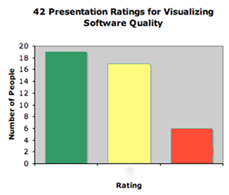
What I didn’t know about PNSQC prior to arrival is that they have a feedback system. Whenever an audience member leaves a talk, they can submit a feedback card. The cards are green, yellow and red. Green indicates a good talk with no problems. Yellow means that the presentation was pretty good and may have had some issues. Red means that the presentation was a waste of time.

What did I think of my presentation? I was a nervous wreck, which is extremely out-of-character for me in speaking to people. The moment I started speaking I forgot to breathe. Once that happens, it takes me a good 5 to 10 minutes to recover. My content was challenging to present because I didn’t have bullet points in my slides. In retrospect, I would have spent more time memorizing an outline since I wasn’t going to have that type of aid on screen. My presentations at Adobe and Microsoft were far better.

Here’s a bar graph of the cards I received.Ratings

When people turn in cards, they can also write comments on the cards.

Comments on green cards:
1. Good talk: a) should all metrics be visualized? b) need clear goals or don’t bother c)green card mostly for thought production.
2. Great content. Practice your presentation skills

Comments on yellow cards:
1. Too slow
2. Great potential, but message didn’t come across clearly. How to read new visual organizations of data is very important instruction to being able to interpret the pics.

Comments on red card:
Visualization shown was a hard way to view list of failures and counts grouped by component.

I also had some comments from my talks at Microsoft and Adobe. These are comments I remember and are as accurate as possible. Since this post is my bucket for feedback, I’m not answering criticism in this particular post. Don’t worry…you’ll be hearing PLENTY from me later, but this post is about what I heard, not what I think. For anyone who’s been waiting to add their $2, the comments for this post would be a good place.

Alas…the criticism:

The process I’m using is static, although at Microsoft there is more of an interest in real time data.

The purpose of these visualizations is unclear.

Someone on twitter mentioned that presentation started slowly for him.

There were two guys in the back who seemed to have read some stuff about visualization and both were highly critical of my work. I didn’t get to talk to them afterward which is a shame because the only way for me to refine my work is by hearing good criticism. If either of you two dudes is reading, please get in touch.

My example with Parallel Sets is using fake data

None of my examples is being used IRL.

There are not enough configuration options

Some took issue with the title of my paper and presentation. “Where’s the quality? I’m not seeing it.”

Why is the white on the treemap of tests at all?

where is the zooming?

Someone did find a bug in the strip treemap algorithm. This is an internationalization problem. A very nice man was trying to understand the order of the strip treemap. The items in this type of layout are ordered horizontally, and this man was concerned with the vertical ordering. He was Asian and I know that Asian writing is vertically ordered and not horizontally ordered. There is currently no strip layout algorithm I know of that will order the items vertically. Since we live in a global economy, I’m considering this a bug of the strip layout as currently implemented.

PNSQC Presentation Links

I’ve just given my talk on Visualizing Software Quality at the Pacific Northwest Software Quality Conference.  The following links are resources from my talk.  If necessary, I’ll add more to them later.  I’m not posting my slides because, well, most of it’s already on my blog.  Don’t feel you’ve lost much from not seeing them because I didn’t use any bullet points at all.  I’m happy to address any questions or issues in the comments.

Update: Today I presented at Adobe and showed off the really awesome Newsmap This treemap has a very interesting “about” page that I hope you will also peruse. Playing with the filters on the newsmap is also a fascinating exploration of what types of news stories are popular in the media of different countries.

Books
Edward Tufte – The Visual Display of Quantitative Information
Stephen B. Johnson – The Ghost Map

Parallel Sets

Treemap Software

The following are available for free:
JTreeMap @benoitx
Sonar
JavaScript InfoVis Toolkit
Treemap 4.1.2 – not for commercial users

The following are commercial:
Panopticon (Don’t know the price for this one.)
The Hive Group  (They called me and said, “it’s really cheap at $20,000.”  I said, “ha, ha.”)

Horizon Graphs
Panopticon invented this visualization, so I’d ask them about it.
Here is Stephen Few’s blogpost on the subject.

Testing a Social Web App Part 2: Test Plan and Strategy

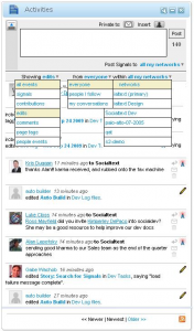
socialtext_screenshotIn the previous post, I discussed the app in Matt Heusser’s latest test challenge and questions I asked about it.  In this post, I will show my overall test strategy and plan.  I know he says there’s a prize, but I’d much rather have some feedback regarding what about this test plan sucks and what doesn’t suck.  I have the big girl shoes (with laces) on so there’s no need to hold back.
From the questions and answers Matt provided, I’ve made a few categories that will influence the focus of my testing.

Prioritized Testing:
Since the primary goal is testing that users can see changes in signals and changes, this will be what I focus on first and most.  Before I saw that this was the primary goal, I questioned whether I should really plan to test every filter combination.

Explicitly described as something to be included in testing:

Every time there is a filter change it must be checked in 3 places:
1.  activities widget
2.  google reader feed
3.  reader widget feed

Reply to signal from activities widget with post
Reply to signal from activities widget with private message

I know I will NOT be testing:
Posting a message or private mail through the text box.

Not prioritized, but still important:
Opening a page through a link in a signal and opening a person’s profile through a link in a signal.  I see one possible defect for this case.  If you look at the picture, everyone but Gabe Wachob’s name is underlined.  I would ask why or log a defect.

Navigating through newer, newest, older pages of posts.

Using the wrench icon to display 5, 10, 15, 20 or 25 activities (queue The Phenomenal Handclap Band)

All tests listed by the product owner.

Overall Test Strategy:
I want to automate the bulk of this testing because you will see below that I have several user scenarios and 3 different views.  The setup and teardown of automated testing such as that used with SeleniumRC + TestNG means I could have tests logging in as my 3 different users and checking each of the three different views as filters are changed in different browsers.  Since I’m using code, I would expect to create tests for each combination of filters.

This doesn’t mean that I wouldn’t do any manual testing.  Markus Gaertner suggested in his blog that he would include time-boxed exploratory testing, and I think this is an important activity that cannot be skipped.   In fact, there are a couple of tests that I’m not sure would be suitable for automation.  I typically do some of this on any feature I’m testing before I finish with my test planning as a way to inform my testing and shake loose a few more questions.  One great aspect of Selenium IDE which I recently discovered is that the IDE will create code for use in TestNG projects.  I can easily see myself simultaneously testing manually and creating code from those manual tests for Selenium RC/TestNG automation.

Risks
My performance testing coverage will be minimal.  It’s just not something I know that much about.  I’m not saying that this app shouldn’t be performance tested, I’m just not the one to tell you how to do it.  I would have to discuss this with the PM and work something out.  Maybe get someone from another project to help and show me some basics.

In the case of the rss feed, usage of Google reader requires a good account.  I guess you can fake these, but I’m pretty sure it’s against their EULA.

Since I don’t do testing of web app user interfaces and funtionality on a regular basis, my estimate for how long this testing would take is a WAG, at best.  I would prefer to have time factored in for creating automation that might, at first, take a little longer to write, but would be reusable.  Time that is not given to me for automation is time that I would add into testing the app for subsequent iterations.  Matt mentions that this testing should take 4 hours, I would give it 8 including automation and setup of test environment.  Again, that’s a total WAG.

Test Environment
Because I’ve defined different types of users and different types of views, I would set up an environment for this test with a set of networks available to these 4 users:

1.  The user who doesn’t have many feeds or friends, maybe they only have 1 of each
2.  The user who has many people on their network but only 1 network
3.  The user who has many people spread across many different networks.
4.  The extreme user who has extreme values of people spread across and extreme number of networks.
5.  User with 1 signal
6.  User with lots of signals

I would also set up a reader widget for each user.  If possible, I would set up a google reader for each user, but I’m not sure this is possible, so there would likely only be limited testing on the google reader feed.

Once users, networks and rss feeds are set up, I would build test fixture objects for these users and each of the views that will need to be checked.  (This is an area where one could really go nuts with design patterns and create some extremely re-usable classes and interfaces for modeling user behaviors, BUT, I have yet to see this in the wild, and I’m assuming I won’t have time to get into this type of elaborate set-up.  I sincerely hope, though, that there are places that do this and that this is where automated testing is headed.)

Test Plan
Matt suggests in his blog that these can be brief one-liners.  This ain’t a novel, so I’m keeping each test short.

User scenario based tests:

Filter testing:
For each user, filter for every available combination and verify that only the correct signals appear from the correct network.  I would automate this and have it run in the background while I do other testing.  I would also perform a manual test for each user with up to 3 different types of filters. I would do this test first because it’s the priority for testing.

For users with 1 network:
Verify “show/from/with” appears with the filter
Verify that there is no drop down box for the users with 1 network

For users with more than one network:
Verify that there is a drop down box for users with more than 1 network
Verify that each network appears in the drop-down box

For all users:
Verify consistent choices in “showing edits” and “from everyone” boxes.
Verify resetting number of visible signals to each value 5 – 25
Make several choices in the filter drop down boxes and verify that page reflects pages in reasonable amount of time.
Check how long it takes for changes made in the widget to be reflected in the user interface and rss feeds.

For user with lots of signal messages:
Verify that newer/older command works with display set for each choice of 5 – 25 messages
Verify that navigation works if user thrashes back and forth in the navigation

For user with no signal messages:
Verify that newer/older commands are not highlighted

User-independent tests:
Verify widget is resizable
Verify widget can be minimized, expanded when minimized
Verify widget can be closed
Verify “post message” text box can be collapsed/expanded with button at top left.
NOTE: I had problems with this one IRL.  If you collapse, the button disappears altogether so you have to reply to someone to get it to re-expand.  What does someone with no messages do?  Would they be able to re-expand? I have a screen shot if you want it.
Verify user profiles can be accessed by clicking on their name, clarify difference between underlined and not underlined names.
Verify wiki pages can be accessed by clicking on them.  Possibly, using automation,  select     signals on a page randomly and perform this test (stick ’em in an array and do random select)
Verify signal can be replied to using the button on the right
Verify signal poster can be privately messaged using button on the right
Verify that a signal can be trashed.
Verify x minutes ago for signals and that timing is passable.
Verify changes in filter are reflected when when navigating between newer and older signals
Verify that choice of 5 – 25 messages reflected when navigating between newer and older signals

This is what I would add to the tests Matt posted which was a list produced by the product owners in pretty much the order I would test.  I don’t see the point in re-typing the product owner’s list here, but I would be sure to test each item on the list.