This post is about feedback I received regarding my presentation at PNSQC and my other presentations at Adobe and Microsoft.
Before I mention my feedback, though, I would like to thank Lanette Creamer and Alan Page. They welcomed me to their companies with such hospitality and respect. These are both extremely busy people who took significant amounts of time out of their day to show me around and make me feel at home. This kind of attention is extremely motivating for me, and shows that they lead from the heart.
On to feedback:
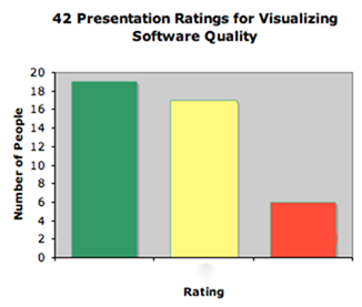
What I didn’t know about PNSQC prior to arrival is that they have a feedback system. Whenever an audience member leaves a talk, they can submit a feedback card. The cards are green, yellow and red. Green indicates a good talk with no problems. Yellow means that the presentation was pretty good and may have had some issues. Red means that the presentation was a waste of time.
What did I think of my presentation? I was a nervous wreck, which is extremely out-of-character for me in speaking to people. The moment I started speaking I forgot to breathe. Once that happens, it takes me a good 5 to 10 minutes to recover. My content was challenging to present because I didn’t have bullet points in my slides. In retrospect, I would have spent more time memorizing an outline since I wasn’t going to have that type of aid on screen. My presentations at Adobe and Microsoft were far better.
Here’s a bar graph of the cards I received.
When people turn in cards, they can also write comments on the cards.
Comments on green cards:
1. Good talk: a) should all metrics be visualized? b) need clear goals or don’t bother c)green card mostly for thought production.
2. Great content. Practice your presentation skills
Comments on yellow cards:
1. Too slow
2. Great potential, but message didn’t come across clearly. How to read new visual organizations of data is very important instruction to being able to interpret the pics.
Comments on red card:
Visualization shown was a hard way to view list of failures and counts grouped by component.
I also had some comments from my talks at Microsoft and Adobe. These are comments I remember and are as accurate as possible. Since this post is my bucket for feedback, I’m not answering criticism in this particular post. Don’t worry…you’ll be hearing PLENTY from me later, but this post is about what I heard, not what I think. For anyone who’s been waiting to add their $2, the comments for this post would be a good place.
Alas…the criticism:
The process I’m using is static, although at Microsoft there is more of an interest in real time data.
The purpose of these visualizations is unclear.
Someone on twitter mentioned that presentation started slowly for him.
There were two guys in the back who seemed to have read some stuff about visualization and both were highly critical of my work. I didn’t get to talk to them afterward which is a shame because the only way for me to refine my work is by hearing good criticism. If either of you two dudes is reading, please get in touch.
My example with Parallel Sets is using fake data
None of my examples is being used IRL.
There are not enough configuration options
Some took issue with the title of my paper and presentation. “Where’s the quality? I’m not seeing it.”
Why is the white on the treemap of tests at all?
where is the zooming?
Someone did find a bug in the strip treemap algorithm. This is an internationalization problem. A very nice man was trying to understand the order of the strip treemap. The items in this type of layout are ordered horizontally, and this man was concerned with the vertical ordering. He was Asian and I know that Asian writing is vertically ordered and not horizontally ordered. There is currently no strip layout algorithm I know of that will order the items vertically. Since we live in a global economy, I’m considering this a bug of the strip layout as currently implemented.