Testing a Social Web App Part 1: Questions

socialtext_screenshotMatt Heusser recently posted a testing challenge on his blog. The challenge is to create a test plan and strategy for the Socialtext’s “Activities” widget. Since I’m very curious and interested in the testing of these types of applications, I decided to put one together.

The picture is a screenshot of the app in question. This post shows a list of “tests” from the product owners. My strategy and plan are in the next post. I’m posting these concurrently, but felt the need to break them up for easier reading.

Before I plan anything, I like to have a full understanding of WHAT I’m supposed to test. The devs I work with will tell you that I ask lots of questions before I test almost anything. Maybe my questions get annoying for them, but I’d rather ask a question and be a nuisance than test something created incorrectly because of too many assumptions and not enough requirements understanding. I try to read through as much relevant documentation as possible before asking, but sometimes, in fact, many times, there is no relevant documentation.

I read through all of the blog posts and comments surrounding this test challenge before I asked questions of my own:

Is there any particular functionality the customer is looking forward to using or functionality that was given particular focus in development?

[Sure. Arguably, the main use of the app will be to see signals and changes in wiki pages. Secondarily, users will want to see things they care about (‘conversations’) and people they care about.]

I’m curious about the rss functionality. It appears that the product owners included this in the test plan. Is there more information about this?

[There’s a little RSS icon in the bottom-right. When you press the product owner, she wants it to “just work” in RSS readers. Finally, you get an exemplar reader: Google Reader. Also, you make a RSS reader widget that supports RSS 1.0, 2.0 and ATOM standards, and it needs to work on that. Does that help?]

Is there a specific reader that this connects with or is it there a list of supported readers?

[The big concern is Google Reader.]

Is the feed supposed to reflect changes in the filters or do you create a feed permanently fixed on current filter settings?

[Yes, the RSS feed link changes depending on what filters you have selected.]

The list from the product owners was fairly specific, but they still left off several items. For example, there are several items regarding being able to re-size the widget but no information about what I assume to be the settings for the widget (wrench in the upper right hand corner.) Is this test round supposed to address EVERYTHING like that or just the specifically mentioned items like re-sizing the widget height.

[Good catch! Yes, monkey-wrench is ‘settings’ and allows you to show 5, 10, 15, 20, or 25 ‘activities’ at a time.]

I also didn’t see anything mentioned about posting signals. Is posting a signal excluded from the testing?

[Yes, you can post signals from the widget. If you want to limit that out of scope to let your test plan be a reasonable size, I’d accept that. You can also REPLY to signals or Reply with a private message; and you’ll need to test that.]

“You can also REPLY to signals or Reply with a private message; and you’ll need to test that.”

In the boxes that show signals, it looks like the arrow on the right is used to reply and the envelope is used to send a message. Is that correct?

[Yes, correct]

I see names in the signals boxes are underlined. What is that and what’s the difference between that and just having a person’s name in blue. Is this another way to initiate a reply?

[A name in blue is a link to that person’s profile. (Think: Facebook ‘info’ page). A page in blue is a link to a page in the wiki; it will open in a new browser tab. Reply and Private reply are initiated at right of an activity in the activities widget. There are other ways to do it, but not on the widget, and so they are out of scope for this exercise.]

In the boxes “showing edits” I see the name of docs are in blue and are bolded. Is something special supposed to happen if I click that?

A Very Knotty Past

Camping at Moran State ParkAdam Goucher does not have the first clue about the can of worms he opened at our much blogged Tuesday night supper meeting. I’m not even talking about Adam’s volunteering my friend and I as founders for the Atlanta Testers Club (currently 2 members). As we settled into our dinner discussion, he was talking about some of the people he knows in the testing community, one of whom is James Bach.

Those of you who know Mr. Bach are probably assuming that this post is going to be a test “discussion.” Nothing could be further from the truth, in fact, this is not a testing post. Adam casually mentioned that Mr. Bach lives on Orcas Island. His mention was something like, “and he lives on Orcas Island, if you’ve ever heard of it.” Have I ever heard of Orcas Island? Indeed, I have. The macro version of my story is that my husband and I camped out on Orcas for several days a couple of years ago (maybe it was this week). The micro story is a tale that shows how some places can unlock our imagination in ways that might not catch up with us for days, months or even years.

I’ve blogged previously about my tendancy towards art. Drawing and painting are with me even if I’ve consicously decided to put it into a box not to be opened until I’m finished with some career goal or degree. When I finished my CS undergrad, I was very happy to go back to art. I learned the ins and outs of drawing Celtic Knots with Cari Buziak. I made gifts for my Grandma and had a great time obsessing over the geometry of very tiny lines.

Then I took a job in Configuration Management. Those of you who have worked in CM or have had to work closely with production releases know exactly how loaded a phrase that is. I was shoved in a basement and given a schedule with absolutely no regularity at all. They gave me a very old laptop so that I could get up at all kinds of hours and work. There’s no support at these hours, so if something went wrong, I had the choice of waking someone up or figuring it out and fixing it myself. I opted for the latter whenever possible. My extra time became devoted to sleep and the art faded into the gray light of the daysleeper I became.

At least I still had vacation. My husband and I visit the Pacific Northwest whenever for possible, and the National Speleological Society (cavers) had their annual convention in Bellingham, Wa. Since my CM job and Chris’s Fire & Rescue job didn’t pay much, we figured out that if we wanted to stay longer, we needed to camp out. We looked for state parks that took online reservations and ended up camping out at Moran State Park on Orcas Island for most of a week. There’s really not much to do there except for hiking, concerning oneself with the tending of a campfire or watching the trees. With this rest and relaxation, my brain finally began unlocking itself from the knots induced by production builds. These knots ended up on pages in my journal as drawings. The art came back! I felt like Kyle MacLachlan in Dune.

See that girl...don't mess with her.  She hasn't been sleeping.

We left Orcas the same way we arrived, by ferry. During the Summer, there are always long lines for ferries in the San Juan Islands. As I waited, I drew a spiral from one of my Celtic drawing books. I don’t know what it is about that place that opened me up in such a big way. The water was a mirror showing me qualities about myself that I had been ignoring, much to my detriment. When we got back to the ATL, I had a tattoo artist tattoo the spiral on my leg and I signed up for a spirals class with Cari. The art never goes away and Orcas Island is with me, permanently.

A Spiral of Birds
Since Adam mentioned Orcas Island, the knots and spirals have returned, but I’m thinking of them in a completely different way than I did before. They have something to teach us about interaction and visualization…

hey lady, where’d you get that treemap?

If you’re on twitter and feel as though you are “muddling through” like I feel most of the time, you’ll understand what a gift it is when someone sends you a really cool tweet.  Here’s the one I got today from @shelkster:

“What Processing code did you use for the treemap? Been exploring various examples. This is a great use of the strip treemap.”

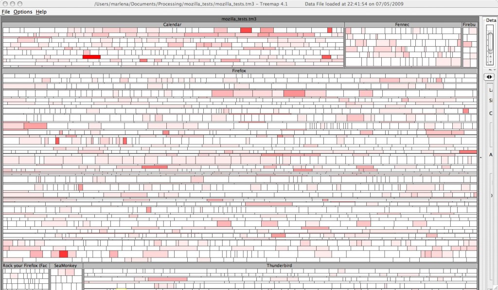
Well, first of all, thanks!  Second of all, I have a confession to make.  The treemap itself is not from Processing. It’s from Treemap 4.1 which is software created at the University of Maryland in their HCIL lab.  What I did write in the Processing IDE was the code that parsed out all of the values. This would have been slightly easier had I just done it Eclipse, but for some reason, I was very curious about using the Processing IDE for this task.  There’s 99% chance I’ll be moving that from Processing into a Java class.

A few weeks ago, I worked through the treemap chapter in Ben Fry’s Visualizing Data“>Visualizing Data and came up with this map of the files on my computer.  (Keep clicking and you’ll get a good view of it)

Processing Treemap of My Files

This one is squarified and has the style of this treemap of the news. So if you have that book, Visualizing Data, this is where you will end up.  The reason I have initally chucked the data into Treemap 4.1 instead of the processing treemap has to do with the data format and configurability.  Treemap 4.1 uses the tm3 format which is basically a tab delimited file.  Ben Fry’s treemap example is “processing” files using java’s ability to search through a file system.  Treemap 4.1 also allows an exploration of data through its user interface.

My post, at this point, might sound like an ad for Treemap 4.1, but I’d like to point out, that it’s only supposed to be used for research and not for commercial purposes.  Maryland’s HCIL lab seems connected to a business group that sells this type of software for extremely large sums of money that I certainly can’t afford.  The tests that I visualized are from Mozilla, and I used this as part of my thesis work. If it weren’t for the ability to configure the treemap from the user interface, I wouldn’t have used Treemap 4.1, I would have used JTreemap. From twittering with the writer @benoitx, I know that it is still being maintained. If you just want to see data in a treemap and want it to be as simple as possible, this is a good choice.

Since I now have the data file I need, my next step is using the Treemap api released under the Mozilla public license to render the Mozilla tests in Processing’s treemap.   I think I remember from my previous digging around, that it supports several layouts including strip.

Probably more than you wanted to know, but uh…it’s my blog.  And thanks for the tweet. It really made my day.

What Do 3859 Tests Look Like?

Mozilla Tests in a Treemap

Yes, that really is 3859 tests in a treemap.  The size of each square represents the number of tests and the color represents the number of failures out of 1 -15 tests.  I used the strip layout to preserve order which means that anyware you see a cluster of red indicates consecutive tests with several failures.

There’s much room for improvement with this one, but the complexity of wrangling this data into the tm3 format forced me to make compromises.  For starters, the hierarchy is missing a layer.  I had to leave it out because it would have duplicated tests, and I wasn’t sure how I felt about that.  Although the number of failed tests does show tests that have had more failing runs, what it doesn’t show is how these tests are grouped by OS.  I want to see failures grouped by OS, and plan to work on this.  Instead of showing number of failed tests, I think it would be more truthful to show a failure rate.  That is, given the number of test runs for that test, what is the percentage of fails.

It’s late, and the Art Wolfe show has finished on PBS.  Oh crap, it’s Sherlock Holmes with Jeremy Brett.  I think Jeremy Brett is awesome.  If I don’t go to bed now, I’ll be up ’til 12.  Please forgive any crazyness in my post this time.  I’m just a little giddy about actually seeing this.

How we read


View Larger MapRecently, I tweeted about reading Steven Johnson’s book, The Ghost Map.  It’s a book that ties in with my PNSQC paper in a very odd way which I’ll write about later.  What I noticed as I was reading, is that the way I read has changed.  The Ghost Map is about a cholera outbreak in London during late August/early September of 1854.

Even though I’m only 1/5 through the book, I’ve already looked up all of the places on Google street view.  This is a new and an old thing for me.  Whenever I’ve read books about a certain location, the next step, for me has always been to find a map of the location and take a good look.  This time, not only can I see the layout of the streets, but I can see what they look like “on the ground.”  Johnson writes about how crowded the streets are and about the dense population of the area.  If you look at streetview, this is immediately noticeable.

Although my copy of this is book is a dead-tree copy, I have to wonder how my experience would change if I had an e-Reader.  With the current paradigm shift taking place from dead-tree books to e-readers, I expect that books themselves will change and will allow the reader different ways to explore their content.  This, in turn, will create different expectations from those who are reading.  I won’t be going from my dead-tree book to my computer to look at the Soho area of London.

Some of you may have used Zemanta for blogging.  Zemanta sits next to the window where I write text in my blog and makes suggestions for pictures and links while I type.   Although, at this point in time, I use Zemanta for writing, I can see a Zemanta like integration for reading as well.  One of the first chapters in The Ghost Map describes clergyman Henry Whitehead making his rounds through the neighborhood.  I’d love to see a map next to the text that I am reading which shows the route he is taking or pictures of some of the places he is visiting.

Language is its own art form.  You can’t just replace a book with a bunch of pictures and links, but there is more than one way to explore writing.  The best writers, I believe, will find ways to integrate the language of their writing with the exploratory journeys their readers take.

Have you noticed differences in the way you read?  How do you think reading will change as we move from paper to e-readers?  If so, I’m very interested in hearing about it.

The Observer Pattern

Gustave Doré's illustration to the European fa...
Image via Wikipedia

This pattern is also known as publish/subscribe. It’s mainly used for keeping objects updated. The object sending out updates is called the “Subject” and the objects receiving updates are called “Observers.”

As a one-to-many example, think of Little Red Riding Hood (LRRH…she recently converted to Scientology. It was on TMZ). She’s setting up Grandma’s RSS feed for the very first time.
Grandma only has 1 feed, from her favorite televangelist, Mozelle Patterson. Grandma only has one feed because after LRRH set it up for her, she’s probably not going to go looking for more.

Mozelle Patterson is a televangelist here in the ATL who has a show on a local channel every Saturday that can, at times, be more amusing than SNL. Let’s say Mozelle Patterson has an RSS feed. Her feed is the subject. All the grandmas who have had someone set up their RSS feed, get the Mozelle Patterson feed. All of the grandmas, including LRRH’s, are the observers.

**subject**

Mozelle

|

|

v

** observer**
-Little Red Riding Hood’s Grandma

**observer**

-Sleeping Beauty’s Grandma

**observer**
-Anansi’s Grandma

Notice that, previously, I said that this is the 1 to many example. Why? Because the next time LRRH visits, she notices that Grandma hasn’t added anymore feeds, but she knows that Mozelle has a special feed specifically for the Gospel music featured on the show, and she adds that to Grandma’s reader. Now, Grandma has 2 different types of feeds from the same place. That’s many to many.

Here’s a class diagram of the 1-to-many example. Note: this is my example, and it’s not guaranteed to be perfect, so don’t take it as “gospel.”

The Observer Pattern

Push/Pull
There are two types of Subject/Observer relationshiop. In the “Push” relationship, the Subject will send the observer everything it needs on notify. For example, If Mozelle’s rss feed contained all of the highlight from the show with pictures, etc., this would be a push. If the feed only contained the title of the show, and Grandma had to click through to view the show highlights, then it would be a pull relationship.

Loose Coupling
This pattern is a great example of loose coupling, because the subject doesn’t know that much about its observers. The observers operate freely and independatly of their updates from the Subject.

Reblog this post [with Zemanta]

Design Pattern Series

I’m taking Design Patterns this Summer.  At this point, I’ve coded enough Java to be able to say I can code Java.  However, I also know that my code typically is not, ahem, polished.  Take for example, this past week.  We’ve been going over publish/subscribe.  Some may call it the “Observer” pattern.  I call it the distributed message queue system I made for distributed systems class a year ago.  Hindsight is always 20/20, right?

Design Patterns is all about avoiding DRY.  This is something that I’m going through even with the Automated Test Framework that I’m writing at work.  It’s all Unix shell scripts.  Since shell scripting was created when programming pretty much meant that you were programming the OS, the syntax itself wasn’t particularly intented to be OO (insert e-vil grin here)…but that doesn’t mean that it can’t be.  At this point, I’ve got scripts everywhere, and they are settling into a pattern.  I chose test patterns and test harness patterns as my research topic for the class. I’m waiting to see if, in the course of my research I find myself looking in the test patterns mirror at my own automated test framework.

In the meantime, I will be making a few posts this Summer about Design Patterns.  I’ll post my research assignment too.  I’m so happy that my teacher is using Head First Design Patterns.  I know that THE Design Patterns book is Design Patterns: Elements of Reusable Object-Oriented Software, typically known as the “The Gang Of Four” book, but the information in Head First Books is always so much easier to remember.  They remind me of The Best Calculus Teacher Ever, Dr. Kathleen Hall who was considered somewhat unorthodox in using colors, YES! colors for describing calculus concepts on the black board.  Every time I read a Head First book or find myself taking the derivative of something, I think fondly on Dr. Hall and her classes.

Testing in a Throwaway Culture

Picture of a Caterpillar 826C landfill compact...
Image via Wikipedia

When was the last time that a prized possession of yours broke before its time? Did it make you angry and disappointed?  Were you surprised or were you half-expecting it to break?

Craftsmanship is a word we no longer associate with many of the things that come into our possession.  This was brought to my attention recently when I had to buy a new motor for my very pricey KitchenAid, Architect II dishwasher.  As software quality professionals, we are all on the other side of this.  How many tests were you able to run?  How well did you really vet that app?  Did you understand the app?  How much of your testing went according to plan, however much planning you had?  Did the plan really matter anyway?

Last week, a good friend of mine wrote about his frustration at not having enough time to execute tests because of other test activities such as shaking out requirements, managing others, etc.  I kind of know how he feels because, as the test army of 1, I am responsible for many of the same activities.  I’ve done all sorts of reports and activities that will pad my resume as a QA resource, but, in the end, this is not why I do the job that I do.

Here is a post from Chris McMahon’s blog that is, in contrast, ALL ABOUT why I am very content as a technical QA.  The utter hack-itude of the exploits described in this post are exactly the domain of the tester I try to be every day.  But then, I have the bug reports to fill out, the test planning to create and the inevitable smoothing over of dev ego.  These things slowly but surely chip away at my day.   My friends blog is a description of how, for more senior test professionals, it becomes their whole job, and my friend isn’t the only tester I’ve noticed lately opining the strategy tasks that take up their time ( you know who you are).

We live in a throwaway culture where breadth is valued way over and above depth, and it seems, to me, that this can heavily influence our careers, sometimes for better and sometimes for worse.  This includes software development AND QA.  I’ve worked in this type of environment, not as a tester, as a CM.  I noticed that for every role, CM, tester or dev as soon as people became technical experts at what they were doing, they were expected to start managing whether they wanted to or not, whether they made a good manager or not.  Am I right or am I right?  What’s missing here is an association depth with value both on the technical side and the management side.

What does this mean, specifically, for testing?  What does it mean to be an expert craftsman in testing?  Does it mean that I can switchblade an app with heuristics, any time, any place? Or does it mean that I will find a way to make some assessment of quality if given the most mountainous of systems to test in extremely adverse conditions?  My personal goal is to work hard at both.  I use test management activities mainly as a way to manage DRY (do not repeat yourself) and to get on with the tests.  It’s almost as if there is a sliding scale with test execution at one end and management of test activity at the other end.  This seems a rather one dimensional approach, and careers are not one-dimensional.

When you are asked to stop testing so much and to start managing more, what will you say?  Are you ready to give up depth as a tester and increase your breadth as a manager?  Is this really a one-dimensional issue?  For some, and maybe even for me at some point, this can be a great decision.  In some places, maybe there is less of a tradeoff than what I’ve seen.  For some, participating more in the management process might mean better quality for an entire team.  If the entire team improves, maybe the software will break less.  If the team is testing KitchenAid dishwashers, maybe the dishwashers will break less, and I won’t have buyer’s remorse for my fancy kitchen appliances.

Love it? Hate it?  Comments are always welcome.

Reblog this post [with Zemanta]

The Game is Afoot: Abstract Accepted for PNSQC

City of Portland
Image via Wikipedia

Yesterday, my inbox had a lovely note from the PNSQC folks saying that my abstract is accepted.  Immediate freaking out and some really bad cube-dancing commenced.  I was already committed to turning out a really great thesis over this summer, and now I’ll be turning out a really great thesis that people will possibly read!  The conference folks still have to approve my final paper, so my presentation will be pending their approval.  I was looking a little more thoroughly at the conference web-site.  It turns out that even if your paper is accepted, your peers will GRADE your prezo with a red, yellow or green card.  Jeez!

All freaking out aside, what a great validation of my topic.  Any tips for presenting or paper writing?  God, I love Portland!

Reblog this post [with Zemanta]

Picasso Ate My Metrics Paper: Visualizing Software Metrics with Treemaps

This past semester, one of the classes I took was a class about Software Metrics.  I was required to write a paper, so I wrote about visualizing software metrics.  All in all, it was a pretty intense semester.  I’ve been settling on a masters thesis topic, which you can read a little about in my previous post.  I’ve written lots of Processing code and been reading through Edward Tufte’s books.  I attended his seminar and gave my own seminar, at work, about Data Visualization.

I guess my artistic side broke through this past semester and demanded my full attention.  Reading through my posts, you would never know that there was a time in my life when I did lots of painting and drawing.  The painting below is a reproduction of a Picasso I painted for my mom during this period.  Last week, I finally broke down and ordered the Adobe Design Premium suite which includes illustrator and Flash.  Yay for educational discounts!

picassodemom

This semester has been all about my artistic impulses and my obsession with technology having a full-on, stay-awake-late, grab-the-bull-by-the-paintbrush collision.  The days when I was writing about visualization and software for job, school and pleasure all at the same time made me smile and think, “it’s good to be me today.”  I know that most people don’t get even 1 day of that and it means that I am finally, after 9 years of higher education, going the right way with my studies.

I’m posting my paper here.  It seemed prudent, before delving into research on visualizing test data, to see what was already out there.  What I found was an emphasis on craziness, a disregard for human-computer interaction and any principles of data visualization.  The glaring exception was the body of work on Treemaps.  If you look at the references of the original paper on Treemaps (I can’t post it because of ACM), you will find a reference to The Visual Display of Quantitative Information.  For this reason, I’ve pretty much stuck with Treemaps in my research.

Are treemaps useful for visualizing the quality of a software system?  I will be working over the next few months to answer that question, and smiling a lot in the process.