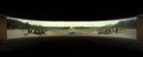
Google’s new museum view is fascinating. It allows you to explore the works of many art museums all over the world from your computer. Looking through the paintings, I saw some that I’ve seen at the museum or even painted for art class. There was one particular painting that made me think about my favorite art history lesson. I won’t reprise that exactly here, but I will give you a taste. The art is different, but the spirit remains.
When looking at a painting, I typically consider:
Narrative: What is happening? Who is in the painting? What is the plot?
Light: What is lit, Where is the light coming from, how much light is there in the painting? Does it set anyone or anything apart?
Shadows: Are they particularly strong? Do they inform the narrative of the painting? Is there something in the shadows?
Color: How intense is the color? Is it used to highlight anything in particular?
Brush strokes: Are they thick and texturized, or minimal?
There is always more to consider, but these are some of the basics.
Here is Google’s view of the Garden at Versailles.
If you work at Microsoft, here is the photosynth version of the painting.
Be sure to give yourself a few minutes to explore the painting. Zoom in and out, move around, explore! Aside from the aspects I mentioned above, how does the medium and size strengthen or weaken the painting?
Now have a look at this photograph taken of Versailles and ask yourself the same questions.
The painting was made between 1818 and 1819. The photograph was taken in 2006. Clearly, the 2 artists had differing technologies at their disposal. I love the character in both of them and could not help but notice that they were created for very different reasons.
While the photographer has left us a note on Flickr, the story of the painting is told in the photosynth. How do you think each one plays to its strengths and where do you think they are weaker? What information do you get from the painting that the photograph does not show you and vice-versa. How does the fact that we are now looking at both of these through a computer screen change the effectiveness of their intended medium. A few years ago, the painting would have been out of luck, but both Google and Photosynth create new methods of looking at the painting that gives us a different kind of connection to what we see in front of us.
Because I’m a software tester, I can’t help but think about the technique of cross-checking which I have used time and time again and how that plays out in comparing these 2 works. How can you tell that the painting is an accurate representation of Versaille? Why did the photographer layer the 2 photographs the way he did?
Can you think of the last time you had result “a” and used a different means to come up with the same answer? I can and it looked nothing like Versailles ;)