What is quality? What is art? Part deux

I’m so appreciative of the discussion that developed from my previous post. I could see that people commenting were really digging deep, so I decided to address some of what was said in this follow-up post.

Here are some of the comments about the definition of quality:

Michael Bolton shared his perspective on Jerry Weinberg’s definition: “To be clear, Jerry’s insight is that quality is not an attribute of something, but a relationship between the person and the thing. This is expressed in his famous definition, ‘quality is value to some person(s).’ ”

Rikard Edgren’s definition: “Quality is more like “good art” than “art”, but anyway: I can tell what “quality to me” is when I see it. I can tell what “quality to others” is when I see it, if I know a lot about the intended usage and users.” Rikard also wrote a post where he clarifies his position a bit.

Andrew Prentice wrote about what he feels is missing from Weinberg’s definition: “I like Weinberg’s definition of quality, but I’m not convinced that it is sufficient for a general definition of quality. Off the top of my head I can think of two concepts that I suspect are important to quality that it doesn’t seem to address: perfection and fulfillment of purpose.”

The definition of quality that I learned is from Stephen Kan’s book, Metrics and Models of Software Quality Engineering. Interesting is that Kan shows a hearty and active disdain for what he says is the “popular” definition of quality. “A popular view of quality,” he writes, “is that it is an intangible trait—it can be discussed, felt, and judged, but cannot be weighed or measured. To many people, quality is similar to what a federal judge once commented about obscenity: ‘I know it when I see it.’ This is sounding familiar, no? Here is where the pretension begins to flow: “This view is in vivid contrast to the professional view held in the discipline of quality engineering that quality can, and should, be operationally defined, measured, monitored, managed, and improved.’ ” Easy, tiger. We’ll look at this again later.

Jean-Leon Gerome’s painting of Pygmalion and Galatea brings this discussion to mind. This is a link to themyth of Pygmalion and Galatea.

I’ve seen this painting in person, at the Met.  Interesting to note is that the artist was painting himself as Pygmalion in this painting. (and I like listening to “Fantasy” by the Xx while I look at this.)

The relationship in this painting is not limited to the one between Pygmalion and Galatea, the viewer is drawn into the relationship as well and the artist, himself is also participating. In this painting, Pygmalion has been completely drawn in by his own creation. The artist was so drawn in by the story that he painted himself into it. I was and am still so drawn in by the painting that it is simply painful for me to tear my eyes away from it. It slays me. When I see it, I feel the painting. I guess you could say that emotion is an attribute of this painting, but in this case, I think it’s more. In this case, the emotion is the painting. Why else does the painting exist? Would this painting work at all if the chemistry were missing? I don’t think it would. What Gerome has accomplished here is the wielding of every technique at his disposal to produce a painting with emotion as raw, basic and tantalizing as the finest sashimi.

But there is more to this relationship than just the fact that Gerome has painted himself as Pygmalion. Let’s examine the relationships that exist in this painting and what they tell us. Starting with just the painting, itself, we have the man and the woman locked in their embrace. They are surrounded with many objects. (I encourage all readers to click through to the Met’s web site. Looking at their web-site, if you double click on the painting, you can move around and zoom in and out to get a closer, more focused look.) What do you notice about all of the objects in the room? I’ve no doubt that some of you are wondering if these objects take away from the focus in the painting. If that were the case, if the painting consisted of only the man and the woman, how would we know that the man was an artist? So why do we need these particular objects? The painting could be restricted to just the hammer and chisel so what’s with all the stuff? This is where our relationship with the painting deepens should we choose to follow the breadcrumbs…

An overview of Gerome’s life, clarifies his choices. As a young artist, he spent a year in Rome which he felt was one of the happiest years of his life. At the time that Pygmalion and Galatea was painted, Gerome was grieving over the deaths of several relatives and friends. By surrounding himself with artifacts from his youth, the artist is traveling back in time to a younger, more “Roman”-tic time in his life. However depressed he may have been when he painted this, Gerome was also experiencing an artistic breakthrough in his sculpting career. Notice the breakthrough in the painting? Now that you know a bit more history, how do you feel about the painting? Does it change your perspective? This has made the painting very introspective for me. The emotion that flows from this depiction of romantic love is one of vitality and power. Perhaps Gerome is evoking these feelings as a way of tapping into his own creative powers. I remember thinking to myself when I first saw this painting at the Met, before I knew anything at all about it, “She is rescuing him.”

To describe quality as a relationship gives it a larger meaning and captures something neglected and dismissed by the literature of the “software crisis” era e.g. books such as Stephen Kan’s. Is quality as a relationship mutally exclusive to quality being an attribute of software? I don’t agree with describing quality as just an attribute. To say that quality is an attribute de-emphasizes the holistic approach to quality I try to take and for which I’m assuming Michael, Jerry Weinberg (going by his definition here only), agile, context, et. al are striving. (Full disclosure: I haven’t read any of Jerry Weinberg’s books. That does NOT mean they are not on my list. I just got out of school and the only thing I’m reading lately is visa paperwork so give me a break here.)

The software we test has its creators and has an audience of users as well. Just as Gerome had his own relationship with this painting, developers know what they want to see which leads to the building of their own relationship with the software they make. How does this affect the relationship between the software and its audience

How does value fit into this? I value the painting because of how it makes me feel when I look at it. After the examination I did, I now understand why I value the painting. As someone who is constantly seeking artistic inspiration, I am happy to go where Gerome and his muse take me. What does this say for value in software? Does the relationship between an audience of users and software create value for the audience members whether they are paying guests or not? The more I dig into this definition, the more I like it because it allows for gatecrashers, those who we did not think would be using our software, but who may find it so invaluable, they become our software’s greatest fans.

I’m going to marinate on this while I think about the 2nd part of Andrew’s comment, namely, that Mr. Weinberg’s definition of quality does not address perfection and fulfillment of purpose. After all, Kan’s two definitions of quality of “fitness for use” and “conformance to requirements” are fairly widely accepted in software.

What are you thinking? Is there something missing from Jerry Weinberg’s definition? How does measurement fit into what I’ve been writing about if it fits at all?

I leave you to think about this and the painting above. If you haven’t already, take a few minutes to click through and take a good, honest, langorous look. Put down the twitter, the kid, the spreadsheet, the reality tv show. Take some deep breaths and give yourself a few moments alone with Pygmalion and Galatea.

to be continued…

Reblog this post [with Zemanta]

Tossing out the map

For the past 5 years I have worked at a company that is over 100 years old.  My business group has been ordered to use the waterfall software development process.  Although my current boss along with everyone else in my group impresses the hell out of me on a daily basis, I’ve known for a while that I would be looking for a job when I finished my masters degree.  (A note to CEO’s everywhere:  asking great employees, especially the geeky ones, to innovate with tools from 1995 is a WASTE of everyone’s time.)

In the time that I’ve worked for my current employer, my husband and I have developed an ongoing love affair with America’s Pacific Northwest.  We’ve traveled there many times for business and for fun.  One of the reasons why I submitted my presentation to PNSQC was its locality.  My primary goal was to make as many contacts as possible for the job search I was planning to begin this January.  I had plans to quit my job once New Years arrived, and move to Seattle so I could look for a job.

We
We <3 the Northwest

So I’ve graduated.  This was supposed to be my need-a-tester? post.  Last year, I made a short list of a few places whose employment prospects really made me drool.  Here are the requirements I had:

  1. location must be Portland, Oregon or Seattle, Washington metro areas
  2. MUST be agile
  3. must have a pro-testing culture
  4. product must have web 2.0 or semantic web features
  5. I must love the product I test so much that I giggle with delight when I use it.
  6. testing must include a pragmatic approach to manual testing and test automation
  7. company must be a place where I can make a significant contribution

The reason why this was supposed to be my need-a-tester post is because I already found a job.  Yes…it IS possible to get a job in this economy.  Not only is it possible, but the job I found fits almost every requirement I had.

The interview process was incredibly rigorous and there were more than a few times when I thought to myself, “there is NO WAY I will get this job.”  I’m not just saying this because I know my new boss reads my blog (Hiiiiii!!)  I’m going from testing a command-line interface to a full-on, Web 2.0, check-this-api-byatch application of epic proportions.  Let’s just say I know a lot more about TestNG and Selenium than I did before my interview.  For those of you on twitter who remember me talking about my “bugs on a plane” testing session, that was part of my job interview.  Not only was I finding bugs on the plane ride home from PNSQC as the power faded on my Mac, but there was a screaming, pretzel-throwing 3-year-old in the seat next to me who did not stop screaming for a full 4.5 hours.

Which requirement in my list was not met?  Unfortunately, I will not be moving to Portland or Seattle, although I still LOVE them both.  I will be moving to Sydney, Australia.

Marlena at the Opera

Say what?!

Yes.

Australia Day 2010 : Jet Ski 2
Image by muffytyrone via Flickr
Sydney Fireworks
Image by Marv! via Flickr
2007 July - Rodney Fox great White Shark Trip ...
Image by Julian Cohen via Flickr

That Sydney, Australia.

I’ve been hired by Atlassian Software.  Although I applied when they began their campaign to hire 32 engineers for their Sydney office, I was already planning to send them an application.  I did not feel the need to look further because they were already tops on my list, regardless of however much of a longshot I felt it was.

I discovered Atlassian in Spring 2008, during my independant study of Web 2.0/Semantic web concepts when I was studying code coverage tools.  Their tool, Clover, not only shows code coverage, but also creates visualizations based on your source code.  And so it was that yours truly was truly hooked and Atlassian became my top choice for employment.

If you look at Atlassian’s products (most of which are $10 for 10 users, except for Clover. tsk, tsk people.) and read through some of their blogposts, you will see that they meet all of my other requirements.  Atlassian has something special going on, and I’m not the only one to have noticed.  It starts with, of all things, their core values and shows up in the quality of the products they create and their almost fanatical user base.  They have the most holistic approach to software I think I have ever seen and, although I haven’t seen their numbers because they aren’t public, they seem to have some pretty good profit margins.  So far, they appear to be winning with integrity. I’m being a bit cheeky here because this is my blog, but if I were running a company, this is how I would approach it.

I’m taking my well-planned out map of a future in the Pacific Northwest and tossing it out for an opportunity to work at a company who’s software made me reconsider what I thought was even possible for software development and also for testing.  It’s a place where I feel the best of my many crazy ideas will be encouraged.

Over the next month, I’ll be selling my stuff, filling out more paperwork and tieing things up in the States.  Working for a company as great as Atlassian and living in a city where everyone, including my new boss, runs around in flip-flops will be challenging, but I will try to manage.  Not to say that this won’t be the most challenging job EVAR, and I won’t totally be working my toucas off in the coming year…but, excuse me while I go look for my 50+ sunscreen…

Reblog this post [with Zemanta]

What is quality? What is art?

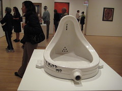
Fountain
Image by sunbs35 via Flickr

When you think of art that was produced in 1917, the heyday of Renoir and Monet, a men’s urinal is probably the last thing to come to mind. Yet, Marcel Duchamp submitted this “masterpiece” called “Fountain” as his statement about the quality of a certain art show. (Read more about him here and here.)

Is this great art?  Is it art at all?  What about it is or is not art?  Duchamp did not make this himself.  He bought it.  What I love about the whole episode is that it was so incendiary that people still argue about it.  People argue about this in much the same way the software testing community will be arguing about the meaning of quality until we’re all dead and the aliens are trying to decide if a McDonald’s hamburger wrapper should be catologued as that-which-the-strange-creatures-called-“art”.

This is why I love languages, writing, art and music.  They deepen the meaning of context.  They find the core of our humanity and our attempts to relate to one another.

There was a lively discussion on twitter today about art and quality:

@chris_mcmahon was asking if this is a high quality painting.  @lanettecream doesn’t think so.  @shrinik pointed out that quality is personal.  @michaelbolton thinks that it’s impossible to mention quality without also connecting the quality to someone specific (an idea of Jerry Weinberg’s in Intro to General Systems Thinking.  I guess I should read that.)  I said:  is that a trick question or what? That’s like asking someone to define art.

When I asked @lanettecream why she didn’t like the painting @chris_mcmahon linked to, she said it looked, “boring and too male.” It’s obviously not of high quality for her.

@chris_mcmahon followed up with:

it’s a painting by Franz Kline that sold for $5,122,500 in Nov 2008. does that change your mind?

Note that this is exactly the type of question and argument that goes on in any art history class.

So if quality is subjective and perception is reality, where does this leave Duchamp’s “Fountain.”  Duchamp obviously didn’t think it was of high quality.  In fact, he submitted it under the name “R.Mutt” because he didn’t want it permanently associated as his art (haha). While it was accepted for the art show, it was never displayed.  The art world is divided.  People pay millions for reproductions of it…what does that say?    How do we define quality at all?  How do we define art?

Although it is easy enough to say “context,” I question whether that is an oversimplification.  What happens when the context is shared by hundreds, thousands or millions of people over time?  My honest opinion of defining quality is that there is no one definition.  Even in defining quality and art, any levels that we give them such as high or low will eventually become superfluous much in the way that “with a long enough timeline, the survival rate for everyone drops to zero.”

Here is a youTube of a performance by the performance art group, Survivial Research Labs.  They build robots and unleash them upon each other until everything is completely destroyed.  I find it oddly hypnotic and comforting. I think I’ll watch it again while I ponder the meaning of testing vs. checking.

Update: Michael Bolton left a really great comment.  Those of you using a reader might want to click through.

Reblog this post [with Zemanta]

This is not a game.

The headlines about Haiti have been sobering. Pictures of buildings in ruins and people who are frustrated, hurt and suffering are all over the news. I’ve already donated to charity, but I’m not finished. I hope that readers of this blog are not finished donating either.

Please have a brief look at this post I wrote on my original blog over 2 years ago.  I was in games class, where we had assignments that required us to play games and write about them every week.  The game I reviewed in this post was named Ayiti and is a game about Haiti.  If you take a minute or two to scan over this post, you will see why I am not finished donating to Haiti.  If you are unfamiliar with the issues being faced by people living in this island nation, playing this game will give you quite an education.  Before you decide that I’m being played like a fiddle by the game’s designer…I’m no idiot.  I realize that the people who designed the game had certain goals in mind, but, based on the few people I’ve met from Haiti, I’m guessing that there’s not much over-dramatization in this particular case.  If you watch the coverage on the news, it’s not hard to see how little many of the people in Haiti had before they lost more than even they thought possible in the earthquake. We’re talking about a country that no longer has a presidential residence, a parliamentary building or a tax office.

This link is for the Wall Street Journal’s map of the damage. It has 3 pages so be sure to click the arrow.

There is currently a lot of media coverage around how effective different charitable organizations are in getting aid to people who need it.  Today, as I was rooting around on American consumer advocate, Clark Howard’s web-site for purely selfish reasons, I discovered that Clark has posted a link to the American Institute of Philanthropy which shows ratings for different charities of how well they’ve gotten aid to people.  Please people, let’s put aside our bickering around metrics, and give a few more dollars.

Here are the charities that had an A+

International Rescue Committee

UMCOR (United Methodist Committee on Relief) (I might be atheist, but last time I checked, a bottle of water was still non-demoninational.)

International Medical Corp.

Note: Red Cross got an A- but I’m linking to them anyway.

Reblog this post [with Zemanta]

Look Up, Don’t Look Down: Testing in 2010

Goodbye Blue Sky
Image by -Alina- via Flickr

This post reflects what I’d like to see for software testing in 2010.  It is a purely selfish list.  Most of what I’ve written about below will find its way into my blog over the next year.  The list is not in a particular order, that’s why I excluded numbers for each item.  I’m just so damn excited about all of it. (and yes, I stole the title from TonchiDot)Btw, I’ve changed my template, my “about” page and my blogroll.

How does my list compare with what you would like to see?

Testers get fed up with their massive tables of data and turn to visualization
Ok, so no surprise here, but I wouldn’t have picked it for a thesis if I didn’t think it was important. Testing meta-data is all around us, and we’ve yet to fully make sense of it. What is it trying to tell us? If we don’t want to boil everything down to a metric number, that doesn’t mean that the meta-data or the secrets it keeps is going away. In reality, we will only have more meta-data. The challenge lies not only in getting our data into a visualization but also in knowing what and how to explore without wasting time. When should we use a scatterplot vs. treemap vs. plain-and-simple bar graph? This goes way beyond anything the Excel wizard will tell us, but that doesn’t mean we won’t need a little magic.

Functional Programming Shows Up on Our Doorstep
I’ve been seeing devs tweet about FP all year, and I’m quite jealous.  If a dev gave you unit tests written in Haskell or Erlang, what would you do?  Testers aren’t the only ones with meta-data overdrive.  Our massively connected world is producing too much info to be processed serially.  Get ready for an FP invasion.  Personally, I’m looking at Scala.

Weekend Testing Spreads
Indie rock fans will smell BS if they see an indie rock countdown for 2009 without Grizzly Bear (had to work it in somehow).  Weekend Testing is obviously the Grizzly Bear of Software Testing for 2009 and their momentum sets a blistering pace.  Markus Gaertner has just announced that it’s expanding to Europe and I’m certain it will spread across the Pacific as well.  This is a bottom up method for learning how to test, and I hope that instructors of testing take note.  I am no expert at testing and want to do whatever I can to set the bar as high as possible.  Hey Weekend Testers, count me in!

Testers who don’t blog start to care about their writing skills
With an emphasis on tools that get software process out of our frakking way, we’ll be left with our writing. Ouch. What’s a comma splice? Hey, I’m going for my Strunk & White. All the great collaboration tools in the world aren’t going to help us if our writing skills suck.

Links Between the Arts and Software Testing Will Be Strengthened
Chris McMahon started us off with his chapter in Beautiful Testing. Shrini Kulkarni blogged about learning the power of observation by looking at art. I’ve been reading about exploratory analysis using data and visualization. By the end of the year, I want software testers besides those of us who self-identify as arty or musical to be talking about why arts education is vital for being a good software tester.

More testers start to care about understanding the fundamentals of measurement and the basics of statistics
Think fast: What is the difference between ratio and proportion? When does the mean not tell an accurate story about a set of numbers? It’s very clear that there are some serious pitfalls in the usage of metrics. What I haven’t seen is lots of testers that have a thorough understanding of basics such as levels of measurement or what a distribution will tell you. I wonder how many testers back away from using these because they don’t understand exactly how they can be harmful or because they just don’t understand exactly how they work in the first place. One assignment I’ve given my blog for the year, is to tackle some basics as applied to testing. Rejecting metrics because you see how they can harm is one thing, rejecting metrics because you don’t understand them is unfortunate. If you count yourself as a tester who is not totally comfortable with math, you’re not alone and, believe me, I understand how you feel.

Collective Intelligence Comes into Play
If I had my way, this list would be vote-able and each reader would have the ability to vote items to the top or bottom. Wouldn’t that be interesting? Unfortunately, I don’t have that…today ;o) But we’re so close! If we’ve got the technology together to analyze the hell out of our blogs through web analytics, what about our tests? I’m picturing myself writing out tests in a wiki with a zemanta-like tool suggesting tests from similar stories that have previously caught bugs. I might not always use these suggested tests, but it would be a great help for brainstorming.

I’ll have an Open Source Project Up and Running for Visualizations to be Used with Testing
This is not a resolution, it’s something I didn’t finish from last year. I am just so late on this. Oh well, giving myself a conduct cut. Seems I had a little conference talk to deal with which quickly morphed into a little talk at Adobe, followed by a little talk at Microsoft. Needless to say, I’ve got some unfinished business that has to do with treemaps. The PNSQC experience was a semester in and of itself. Time to get back into the visualizations.

It’s not lost on me that my last few posts have been sort of personal and high-level. I’ve had big changes and events happening in my life, which has made maintaining focus, well, difficult. You’ll hear all about it soon enough. Trust me, it’ll be good.

Reblog this post [with Zemanta]

Real-time Collaboration

Many of us are now communicating through twitter which means that arguments, conversation and even software testing itself is evolving in real time. Real time is no longer a future possibility, but for most of us, the reality.

Personally, I have found this new real-time focus very challenging because, despite the collaborative possibilities, it’s too easy to say something careless and stupid that you can’t take back. Have you ever thought to yourself, “Gosh, that wombat joke was so funny at the time!” I know I have. Even if you can delete a tweet, that doesn’t mean nobody saw it. On a larger scale, this places all of the petty, back-channel political squabbling of our software testing eco-system in a front-and-center position like never before.

The communal win of real-time communication is that now, if we’re going to argue, there is more motivation to make it constructive instead of disparaging. For an example of this, see this article on Code Coverage by Alan Page and Matt Heusser. I was happy to write the introduction, but in all honesty, these two great men shepherded themselves through the writing of this article. The testing community is much better for it. Their original twitter conversation could have devolved into petty squabbling, but Alan and Matt were able to turn their conversation around. The resulting article is thought provoking, and shows what can be accomplished when testers who strongly disagree have an honest and respectful exchange about why they disagree. I want more of this.

Fellow von TesterBlogger, Lanette Creamer, has been writing, brilliantly, about respectful discourse. As of now, she has written these two posts: Post 1, Post 2. I love what she has said about diversity because it highlights how our communication is changing and the need for each of us to be open enough to change our own ways of communicating. I am having to re-learn how I discuss and debate with others because I’m being exposed to people who communicate in a very different ways to which I am not at all accustomed. I can only hope that others will allow for my differences in this ever-widening, two-way street of the real-time world.

I am an atheist, but have found valuable treasures within Christianity as I have in other world religions. I altered the passage below from the prayer of St. Francis of Assisi and try to follow it with every communication I make. If I’m in doubt about something I’m about to say or post, I look over this. It’s never steered me wrong. I make mistakes like everyone else does, but if I do, I come back to this. I read it over and try again.

I am an instrument of peace,
Where there is hatred, I will show love;
where there is injury, I will forgive;
where there is doubt, I will show faith;
where there is despair, I will hope;
where there is darkness, I will be light;
where there is sadness, I will be joy;

I will do my best to console more than I seek to be consoled;
I will do my best to understand more than I seek to be understood;
and I will do my best to love even more than I try to be loved.

For it is in giving that we receive;
it is in pardoning that we find forgiveness;
and it is in living gracefully that that we will find the eternal.

Reblog this post [with Zemanta]

Longevity: It Ain’t Over ’til It’s Over

Morning near Lake Garibaldi, BC, Canada

My husband and I used to watch the Eco-challenge adventure race. If we had to, we’d order the VHS tapes. We played them in a continuous loop. These races were memorable not just for the beautiful locales and different activities the participants were expected to complete, but for the many different competitors (Who can forget Team “USUK” or the yellow tights of Team Helti?). My favorite eco-challenge competitor was a lady from Australia named Jane Hall. She was a master at sea kayaking and very good at all of the other activities. The reason why she was my favorite was her attitude. “We’re just a bunch of guys and gals who want to have a go,” she said about her crack team of outdoor sports experts.

Jane’s words and her attitude have carried me through all kinds of personal challenges, sporting and otherwise. If you ever meet me, you will NOT remark on how athletic my build is. Despite a serious lack of co-ordination and my addiction to baked goods, I’ve never had a really bad fracture or injury. My special athletic ability is staying in an upright position for any length of time even if I’m tired and sore. I also enjoy myself no matter how slow my pace may be, and I will try almost anything. I’ve plumbed the depths of many caves and surveyed some of them. I’ve backpacked and camped out on a snow-filled Canadian mountainside. I’ve hiked for miles on cold, windy Irish Cliffs and through hail in New Mexico. My husband and I got married on one of the many remote beaches of Cumberland Island, Georgia.

My Wedding on Cumberland Island

This is the spirit I brought to software and to my half-marathon training program. I gave myself permission to really suck at programming and computers as long as I kept practicing and stayed interested. For the half-marathon training, I decided that speed and pace just couldn’t be factors for me. In examining the schedule I decided to follow, I realized that consistency for the shorter 30 minute runs was really the key. Whether I was walking, shuffling, limping or any combination of the three, getting my butt across the finish line was my solitary goal. Here I am at the finish line with my friend, Melissa.

Finishing the Atlanta Half-Marathon

My masters thesis is far from perfect. Read it, and you will find holes. I could make excuses for these, but I don’t see the need. I’m usually a very self-deprecating person, but in this instance, I am quite proud of myself. My thesis is the snapshot of a beautiful moment in time, and the picture includes many more people than just myself. Those of you who have left me comments, sent me emails, followed me on twitter, mentored me and talked with me have a part in my success as well. Thank you from the bottom of my heart.

Remember the scene in the movie Dead Poet’s Society where Robin Williams is showing his students the school’s trophy case? He tells them to look at it and think about the phrase, “carpe diem.” As they are staring, he begins to whisper in a raspy voice, “carpe…carpe diem. Seize the day, boys!” For the first time in my professional life, I know without a doubt that I didn’t just, “seize the day.” I rode that day clear across the contiguous 48 states and back. Here I am. I’m still upright, still breathing and, more importantly, still interested.

I did not finish everything I wanted to finish this past semester, but the semester is done and my degree program is over. This does not mean I will be putting anything down. In fact, this gives me the chance to re-evaluate some of what I was doing, and make some positive changes that weren’t possible in the context of school work. As I am in it for the long haul, your regularly scheduled blog will certainly continue.

When I think about all I’ve accomplished in the past year or two, this scene from the movie Vision Quest comes to mind. Many time, I have felt like Loudon Swain working his up the wall with two pegs. I can hear all of you cheering me on, and I love it! Thanks, again!

p.s. I have to work through some red tape to get my thesis posted online, but I’ll post when it is up.

PNSQC Slides and Paper Are Up

My thesis defense is tomorrow which is why I haven’t posted in a couple of weeks.  If all goes well, I’ll be posting a link to that in the next week.

This is just a quick post to say that my paper and  presentation have been added to the PNSQC web-site, along with everyone else’s paper and presentation: click here and have fun exploring.

Since I don’t read from powerpoint slides, you won’t find much in the way of explanatory verbiage in the slides, but I’m happy to answer questions if there’s something you’d like me to clarify.  Ideally, I would download the paper, and read the paper while you have the slides up.  They told me to make all of the pictures for the paper extremely small and grayscale…sigh.  Kind of kills the whole visualization aspect of my paper, but I understand they had good reasons for asking.  This is exactly why Edward Tufte took out a 2nd mortgage on his house, and self-published his first book.  I would write more about that because it’s a post in and of itself, but my recursion ain’t workin’, gotta go!

Testing is Interdisciplinary

I have 2 undergraduate college degrees. One of them is a BS in Computer Science, the other is B.A. in Interdisciplinary Studies. Here is the program where I matriculated. I had 2 minors as part of this degree, Theater and Art History.

The Interdisciplinary Department at my school was an extension of a residential Freshman/Sophmore program called Watauga College and now called Watauga Global Community. We all lived in the same dorm and had classes together on the ground floor. People outside of our program did not know what the hell we were doing. There were times when we didn’t know either.

We did not have classes like English, History or Art. We would register for 10 hours of an IDS course number. For that 10 hours, we would have lectures and experiences involving topics such as English, History, Art, Religion, Philosophy and Anthropology. For example, we would read about different religions, their histories and then participate in different services of the different religions. I have fasted for Ramadan and was nearly knocked out cold by incense in a tiny Episcopal chapel. After we were finished listening, reading and experiencing we would usually right a 10 to 20 page paper. (Maybe that’s why some of my blog posts are on the lengthier side ;o)

After I decided a career in Theater wasn’t for me, I ended up majoring in Interdisciplinary Studies with a concentration in German Studies. I went to Germany for a year as part of my studies. Deshalb, kann ich noch ein tropfhen Deutcsch verstehen. During my year in Germany, I became obsessed with modern Art History. I dragged my friends to the Stuttgart Modern art musuem several times despite the 3 hour train ride back and forth. When I returned from Germany, I weasled my way into an independent study with a Professor who was rather skeptical that I could write a decent, lengthy paper on Wassily Kandinsky. I made an A.

What is Interdisciplinary Studies?
Another term frequently used in place of “interdisciplinary” is “cross-disciplinary.” This means you are using ideas from different types of subjects, applying some critical thinking and making connections. There is a feedback loop involved. You have to go back and forth between topics refining your ideas and communicating with others to gain perspective on your own thoughts. IDS majors end up with great writing skills because writing is the most mainstream of several ways to work out the crazy thoughts and complicated connections that happen when you put together topics like math, animation, art, and feminist studies.

What does this have to do with testing?
At this point, I believe I have found success as a tester because of my ability to focus/defocus, consider different perspectives and communicate what I have found. The only certainty I have about software testing is that there is no one way to test software. Not only must we understand various aspects of technology, but we have to understand how that technology is applied in a certain subject area for different sets of users, all of whom have a different perspective. This requires technical skills, reasoning skills and communications skills. Because of the rapidly expanding global economy, a global focus on the customer is also required.

How is testing an interdisciplinary?
James Bach’s slide on focus/defocus sticks in my mind. It says that after you’ve been looking at software a certain way for any amount of time, you must pull your head up from what you’ve been doing and violate your own pattern. Focus on the last 4 words. How do you violate your own pattern? To violate your own pattern you must rely on other’s patterns.

Violating a pattern is at the heart of interdisciplinarity. This means we have to find a new perspective on the software we are testing. To do that, it is necessary to understand the perspective of other people different from you. After we’ve done that we must make connections between the different ways we’ve looked at the software. There is a feedback loop involved between the technology we are testing, how we understand that technology and our user’s perspective of how they will use that technology. After that we have to communicate what we’ve found.

There were quite a few IDS majors who self-identified themselves as the disciplinary problems of academia. Teachers either loved us or hated us because we would ask all of the crazy questions and we could spot the bullshit teachers who didn’t know what they were talking about from a mile away. Apathy was checked at the door. Our opinions were often quite different from that of the general college population at Appalachian State and we were constantly arguing amongst ourselves.

I found this quote on the Wikipedia page for “interdiscliplinary”:

Interdisciplinary programs sometimes arise from a shared conviction that the traditional disciplines are unable or unwilling to address an important problem.

Sounds like software testing to me.

This is from The Seven Basic Principles of the Context-Driven School of Testing:

Good software testing is a challenging intellectual process.

As an IDS major, I suggest a refinement for this statement. I think it should say, “Good software testing is a challenging, intellectual and interdisciplinary process.

Reblog this post [with Zemanta]

Lost in Aggregation

Talking at Microsoft the week before last was an exciting experience.  I saw the fabled soccer fields while soccer was being played, I got to see piles of Windows Vista in an actual bargain bin for $10 at the Microsoft store, and I gave my talk to a room that was filled with close to 100 people.  They asked me lots of intelligent questions.

There are few things more useful to research than intelligent, hard questions.  They show me what my project is lacking.  If I can justify a hard question, I know that I’m very close to having an idea fleshed out.  The same is true for presentations.  If the audience doesn’t understand what I’m talking about or if certain points are unclear, it shows in their questions.

This happened at Microsoft.  I got comments about how my treemap of tests was noise.  Someone else told me that “Bill G” would not have liked being presented with so many data points at all.  Someone else suggested that I take a more aggregated approach to presenting the data.

What this tells me is that I missed a MAJOR point in my presentation.

Ladies, gents, testers, Microsofties …I give you Professor Tufte:

“Graphical displays should
show the data…Graphics reveal data.”

-The Visual Display of Quantitative Information [13]

Think about how a visualization reveals its data.  In a bar chart, since you are looking at a count of either items or percentage points, an accurate scale will show you the quantity of individual data points.  If you look at the same information in a pie chart, you will not get this information.  Part of the appeal of a treemap is that you can see the individual items as parts of a whole. Once you aggregate, you lose this perspective.

In the Ghost Map, you can see individual deaths.  This is how Dr. Snow was revealing his data.

As an example of how this plays out in business, I work under an executive VP who will not look at charts. Why does he prefer to only look at numbers?  Keep in mind, that I work in financial services and that our business is driven by obscenely large, even excessive amounts of financial data.  The tables this man analyzes have thousands of data points.  I have never observed him exploring this data personally, but I have been told that he can zero in on an interesting number in seconds.  He prefers looking at data as opposed to charts because a data point is a number he can see and, to an extent, trust…a percentage, average or slice of pie, not so much.

Mistrust in charts is why I am specializing in visualizations that show every data point and not just an aggregation.  The best visualizations show not just conclusions, but also supporting facts.  I haven’t met Bill G. so I don’t know exactly what he would want to see, but I would give him the choice of staying with the aggregated view or drilling down.  Viewers should be allowed to interact with data enough to form their own trust with it.  Providing only an aggregated view or a conclusion does not give them this opportunity.  Excellent visualizations reveal their data.