PNSQC Wrap-Up: Where’s the Quality?

Previous to my attendance at PNSQC, I had a couple of “Bach moments.”  PNSQC was no exception.  I took his class and believe I was able to distinguish myself as thoroughly mediocre.  Is it just me or does that man have “laser focus” when someone says something that interests him?  This changed dramatically, however, once I hit the first poster session.

I knew people would look at my poster because it had pictures on it, but I wasn’t quite prepared for the volume of interest.  It started right away.  As the last pushpin was going into place, I heard someone behind me say, “um…where’s the quality.”  I turned around to see a) baseball cap b) glasses c) beard.

OMG…JAMES BACH!!!!!!!

“Excuse me, but I’m looking and I don’t see any quality here.”  He glanced all around my poster from the top left corner to the bottom right corner. “Nope, still no quality.”

Meanwhile, I’m still processing who the hell this is.  Love him or hate him, you have to admit that he sits among the “Monsters O’ Test.”  As he keeps drilling me, I notice more people showing up behind him.  When Monsters O’ Test speak, people listen.  I felt like Peter Billingsly, frozen on Santa’s lap in The Christmas Story.  The crowd turned into a gang of elves.  I know that Mr. Bach was asking me about software quality, but really, all I heard was, “HO! HO! HO!”  I think he realized that I was completely petrified, because he kind of backed off.  My reviewer had made his way over to my poster and mentioned that Mr. Bach should read my paper.

I honestly think I started babbling, because I don’t remember a word I said.  There are a few things I know about myself including the fact that I have a complete inability to handle meeting people I respect. My fangrrl tendencies are directly proportional to how much I respect someone.   This is because my respect can only be earned.  (Hey, Atlas Shrugged fans, y’all know what I mean.)  I never respect someone just because I hear they are “important.”  The flip side is that people I respect mean a lot to me.  As an example, I am such a fangrrl of the book How We Test Software at Microsoft since I read it last winter.  I learned so much about testing from this book, and what I learned, I apply every day.  Last summer, Alan Page posted that he likes my blog and was looking forward to seeing me at PNSQC.  The post showed up in my reader, and I swear I nearly had a heart attack.  It was so flattering and unexpected.  I’ve now met Alan (Hiiiiii!), and have managed to calm my fangrrl tendencies somewhat.  This is not to say that there wasn’t some maniacal giggling on my part as Alan showed me around the Microsoft campus last week.  Unfortunately, fangrrl behavior is a dimmer and not an on/off switch.

But back to the matter at hand: there is an unanswered question that was asked of my poster.  Where’s the quality?  This is an excellent question and is, in fact, a question I can’t answer.  My inability to answer this question highlights the backstory of my conference presentation.  When I submitted my abstract to PNSQC I did not have a treemap of tests or any idea if I would be successful at making one.  I also didn’t know if this would be a valid way to look at tests.  Titles are important.  They are a succinct description for a project.  In my case, I knew that I needed a good title if I had a snowball’s chance in hell for my presentation to be accepted.  I decided to go big.  “Visualizing Software Quality” was the biggest title I could think of for what I was (and still am) attempting.  That is, visualizing all aspects of the software tester’s experience.  I don’t want to explore through lists, I want to explore through visualization.

So where’s the quality?  I no longer feel that this is the best question or the best title for my investigations.  I’m focusing on visualizing aspects of software testing.  What is the best way to get a “big picture” view of tests, defects, customer annoyance, wtf’s per minute or any other multi-variate information that testers must face?  What information do we really care about and how is it best presented in an interactive and graphic way for us to explore?  If we are looking at a “big picture” view of tests and defects, what are looking for and where do we want to go after we find something interesting in our data?  This is entering the realm of “exploratory data analysis.”   I can’t answer Mr. Bach’s question, but I’m quite flattered that he was intrigued enough to ask me.  And I don’t want a football or a Red Rider BB Gun for Christmas.  I think I’d much rather find John Tukey’s book, Exploratory Data Analysis under my Solstice tree.

Reblog this post [with Zemanta]

PNSQC Wrap-Up: The Feedback

This post is about feedback I received regarding my presentation at PNSQC and my other presentations at Adobe and Microsoft.

Before I mention my feedback, though, I would like to thank Lanette Creamer and Alan Page. They welcomed me to their companies with such hospitality and respect. These are both extremely busy people who took significant amounts of time out of their day to show me around and make me feel at home. This kind of attention is extremely motivating for me, and shows that they lead from the heart.

On to feedback:

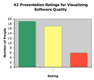
What I didn’t know about PNSQC prior to arrival is that they have a feedback system. Whenever an audience member leaves a talk, they can submit a feedback card. The cards are green, yellow and red. Green indicates a good talk with no problems. Yellow means that the presentation was pretty good and may have had some issues. Red means that the presentation was a waste of time.

What did I think of my presentation? I was a nervous wreck, which is extremely out-of-character for me in speaking to people. The moment I started speaking I forgot to breathe. Once that happens, it takes me a good 5 to 10 minutes to recover. My content was challenging to present because I didn’t have bullet points in my slides. In retrospect, I would have spent more time memorizing an outline since I wasn’t going to have that type of aid on screen. My presentations at Adobe and Microsoft were far better.

Here’s a bar graph of the cards I received.Ratings

When people turn in cards, they can also write comments on the cards.

Comments on green cards:
1. Good talk: a) should all metrics be visualized? b) need clear goals or don’t bother c)green card mostly for thought production.
2. Great content. Practice your presentation skills

Comments on yellow cards:
1. Too slow
2. Great potential, but message didn’t come across clearly. How to read new visual organizations of data is very important instruction to being able to interpret the pics.

Comments on red card:
Visualization shown was a hard way to view list of failures and counts grouped by component.

I also had some comments from my talks at Microsoft and Adobe. These are comments I remember and are as accurate as possible. Since this post is my bucket for feedback, I’m not answering criticism in this particular post. Don’t worry…you’ll be hearing PLENTY from me later, but this post is about what I heard, not what I think. For anyone who’s been waiting to add their $2, the comments for this post would be a good place.

Alas…the criticism:

The process I’m using is static, although at Microsoft there is more of an interest in real time data.

The purpose of these visualizations is unclear.

Someone on twitter mentioned that presentation started slowly for him.

There were two guys in the back who seemed to have read some stuff about visualization and both were highly critical of my work. I didn’t get to talk to them afterward which is a shame because the only way for me to refine my work is by hearing good criticism. If either of you two dudes is reading, please get in touch.

My example with Parallel Sets is using fake data

None of my examples is being used IRL.

There are not enough configuration options

Some took issue with the title of my paper and presentation. “Where’s the quality? I’m not seeing it.”

Why is the white on the treemap of tests at all?

where is the zooming?

Someone did find a bug in the strip treemap algorithm. This is an internationalization problem. A very nice man was trying to understand the order of the strip treemap. The items in this type of layout are ordered horizontally, and this man was concerned with the vertical ordering. He was Asian and I know that Asian writing is vertically ordered and not horizontally ordered. There is currently no strip layout algorithm I know of that will order the items vertically. Since we live in a global economy, I’m considering this a bug of the strip layout as currently implemented.

PNSQC Presentation Links

I’ve just given my talk on Visualizing Software Quality at the Pacific Northwest Software Quality Conference.  The following links are resources from my talk.  If necessary, I’ll add more to them later.  I’m not posting my slides because, well, most of it’s already on my blog.  Don’t feel you’ve lost much from not seeing them because I didn’t use any bullet points at all.  I’m happy to address any questions or issues in the comments.

Update: Today I presented at Adobe and showed off the really awesome Newsmap This treemap has a very interesting “about” page that I hope you will also peruse. Playing with the filters on the newsmap is also a fascinating exploration of what types of news stories are popular in the media of different countries.

Books
Edward Tufte – The Visual Display of Quantitative Information
Stephen B. Johnson – The Ghost Map

Parallel Sets

Treemap Software

The following are available for free:
JTreeMap @benoitx
Sonar
JavaScript InfoVis Toolkit
Treemap 4.1.2 – not for commercial users

The following are commercial:
Panopticon (Don’t know the price for this one.)
The Hive Group  (They called me and said, “it’s really cheap at $20,000.”  I said, “ha, ha.”)

Horizon Graphs
Panopticon invented this visualization, so I’d ask them about it.
Here is Stephen Few’s blogpost on the subject.

Visionary Testing: When Blogs Collide

Esther before Ahasuerus www.metmuseum.org

What the hell does some ancient chick in a dress have to do with software testing? I’m not paid to look at artsy-fartsy pictures! I’m paid to break stuff and pass it on to the devs to figure out!

Is that so?

How many times have devs come back to you for clarification on a bug report you’ve written? How much does the testing you do depend on your ability to notice not only the functionality of an application but the relationships among different functionalities? You see the chick in the dress? She was painted by Artemisia Gentileschi, another chick in a dress who was fairly bitter about life in general, and with good reason. Paintings hide plenty of secrets, just like software applications hide plenty of bugs. As software testers, sometimes we have prior knowledge of the story and sometimes we don’t. Regardless, our task is to ensure that the story makes sense for users, and when it doesn’t we have to report to the developers what is not making sense.

Three of the blogs in my testing blog folder on google reader(the blog roll posted here needs an update) contained posts this week that fit together incredibly well. I think they fit together because they highlight the need in software testing for observation and communication skills.

The first is Shrini K’s blog, Thinking Tester. Shrini blogged about “Necessary Tester Skills” and included this link to an article on the Smithsonian Magazine’s web-site. It’s about police officers in New York City taking a class about observation taught by an Art History scholar, and is a very rewarding read. What these officers are getting out of their trip to the Met is a lesson in how an effective description can radically change outside perception. That’s all I’m gonna say because I think you should read it.

The second post was written by Catherine Powell on her blog, Abakas. Catherine is writing about “Magic Words” in testing. I’ve seen this stuff defined in my metrics textbook and other various places, but what Catherine adds is her $2.00 on how these words are generally perceived.

Put these together with Elisabeth Hendrikson’s astounding post on Test Case Management systems, and I see the writing on the wall, or ahem, wiki. Why shouldn’t we eventually communicate our test efforts by writing down, in a somewhat domain-specific language what we see an application doing? If we are writing in a domain specific language and we have semantic web “stuff” at work, behind-the-scenes, why wouldn’t our stream-of-consciousness writing turn into tests and defects? Having a language, however, won’t matter at all if we lack the ability to employ careful observation in our testing.

I have a challenge for you. There’s no prize involved, but you might find yourself feeling rewarded. I challenge you to find a work of art be it a painting, sculpture, installation or anything you deem “art-worthy” and study it. This can be in a museum, a coffee house or your mom’s living room. Once you feel you have an understanding of what you are looking at, try to communicate your understanding with words. Extra points to you if you can also communicate what you’ve written in a language other than your own. Did you write about events taking place or where you describing some objects on a table? Were you thinking about light and shadow or did the materials used in the art catch your eye? If you are describing a portrait, does the painting possibly capture more of the person’s spirit than a photograph?

Is this really so different from trying to communicate what you’ve noticed in a test?

Testing a Social Web App Part 2: Test Plan and Strategy

socialtext_screenshotIn the previous post, I discussed the app in Matt Heusser’s latest test challenge and questions I asked about it.  In this post, I will show my overall test strategy and plan.  I know he says there’s a prize, but I’d much rather have some feedback regarding what about this test plan sucks and what doesn’t suck.  I have the big girl shoes (with laces) on so there’s no need to hold back.
From the questions and answers Matt provided, I’ve made a few categories that will influence the focus of my testing.

Prioritized Testing:
Since the primary goal is testing that users can see changes in signals and changes, this will be what I focus on first and most.  Before I saw that this was the primary goal, I questioned whether I should really plan to test every filter combination.

Explicitly described as something to be included in testing:

Every time there is a filter change it must be checked in 3 places:
1.  activities widget
2.  google reader feed
3.  reader widget feed

Reply to signal from activities widget with post
Reply to signal from activities widget with private message

I know I will NOT be testing:
Posting a message or private mail through the text box.

Not prioritized, but still important:
Opening a page through a link in a signal and opening a person’s profile through a link in a signal.  I see one possible defect for this case.  If you look at the picture, everyone but Gabe Wachob’s name is underlined.  I would ask why or log a defect.

Navigating through newer, newest, older pages of posts.

Using the wrench icon to display 5, 10, 15, 20 or 25 activities (queue The Phenomenal Handclap Band)

All tests listed by the product owner.

Overall Test Strategy:
I want to automate the bulk of this testing because you will see below that I have several user scenarios and 3 different views.  The setup and teardown of automated testing such as that used with SeleniumRC + TestNG means I could have tests logging in as my 3 different users and checking each of the three different views as filters are changed in different browsers.  Since I’m using code, I would expect to create tests for each combination of filters.

This doesn’t mean that I wouldn’t do any manual testing.  Markus Gaertner suggested in his blog that he would include time-boxed exploratory testing, and I think this is an important activity that cannot be skipped.   In fact, there are a couple of tests that I’m not sure would be suitable for automation.  I typically do some of this on any feature I’m testing before I finish with my test planning as a way to inform my testing and shake loose a few more questions.  One great aspect of Selenium IDE which I recently discovered is that the IDE will create code for use in TestNG projects.  I can easily see myself simultaneously testing manually and creating code from those manual tests for Selenium RC/TestNG automation.

Risks
My performance testing coverage will be minimal.  It’s just not something I know that much about.  I’m not saying that this app shouldn’t be performance tested, I’m just not the one to tell you how to do it.  I would have to discuss this with the PM and work something out.  Maybe get someone from another project to help and show me some basics.

In the case of the rss feed, usage of Google reader requires a good account.  I guess you can fake these, but I’m pretty sure it’s against their EULA.

Since I don’t do testing of web app user interfaces and funtionality on a regular basis, my estimate for how long this testing would take is a WAG, at best.  I would prefer to have time factored in for creating automation that might, at first, take a little longer to write, but would be reusable.  Time that is not given to me for automation is time that I would add into testing the app for subsequent iterations.  Matt mentions that this testing should take 4 hours, I would give it 8 including automation and setup of test environment.  Again, that’s a total WAG.

Test Environment
Because I’ve defined different types of users and different types of views, I would set up an environment for this test with a set of networks available to these 4 users:

1.  The user who doesn’t have many feeds or friends, maybe they only have 1 of each
2.  The user who has many people on their network but only 1 network
3.  The user who has many people spread across many different networks.
4.  The extreme user who has extreme values of people spread across and extreme number of networks.
5.  User with 1 signal
6.  User with lots of signals

I would also set up a reader widget for each user.  If possible, I would set up a google reader for each user, but I’m not sure this is possible, so there would likely only be limited testing on the google reader feed.

Once users, networks and rss feeds are set up, I would build test fixture objects for these users and each of the views that will need to be checked.  (This is an area where one could really go nuts with design patterns and create some extremely re-usable classes and interfaces for modeling user behaviors, BUT, I have yet to see this in the wild, and I’m assuming I won’t have time to get into this type of elaborate set-up.  I sincerely hope, though, that there are places that do this and that this is where automated testing is headed.)

Test Plan
Matt suggests in his blog that these can be brief one-liners.  This ain’t a novel, so I’m keeping each test short.

User scenario based tests:

Filter testing:
For each user, filter for every available combination and verify that only the correct signals appear from the correct network.  I would automate this and have it run in the background while I do other testing.  I would also perform a manual test for each user with up to 3 different types of filters. I would do this test first because it’s the priority for testing.

For users with 1 network:
Verify “show/from/with” appears with the filter
Verify that there is no drop down box for the users with 1 network

For users with more than one network:
Verify that there is a drop down box for users with more than 1 network
Verify that each network appears in the drop-down box

For all users:
Verify consistent choices in “showing edits” and “from everyone” boxes.
Verify resetting number of visible signals to each value 5 – 25
Make several choices in the filter drop down boxes and verify that page reflects pages in reasonable amount of time.
Check how long it takes for changes made in the widget to be reflected in the user interface and rss feeds.

For user with lots of signal messages:
Verify that newer/older command works with display set for each choice of 5 – 25 messages
Verify that navigation works if user thrashes back and forth in the navigation

For user with no signal messages:
Verify that newer/older commands are not highlighted

User-independent tests:
Verify widget is resizable
Verify widget can be minimized, expanded when minimized
Verify widget can be closed
Verify “post message” text box can be collapsed/expanded with button at top left.
NOTE: I had problems with this one IRL.  If you collapse, the button disappears altogether so you have to reply to someone to get it to re-expand.  What does someone with no messages do?  Would they be able to re-expand? I have a screen shot if you want it.
Verify user profiles can be accessed by clicking on their name, clarify difference between underlined and not underlined names.
Verify wiki pages can be accessed by clicking on them.  Possibly, using automation,  select     signals on a page randomly and perform this test (stick ’em in an array and do random select)
Verify signal can be replied to using the button on the right
Verify signal poster can be privately messaged using button on the right
Verify that a signal can be trashed.
Verify x minutes ago for signals and that timing is passable.
Verify changes in filter are reflected when when navigating between newer and older signals
Verify that choice of 5 – 25 messages reflected when navigating between newer and older signals

This is what I would add to the tests Matt posted which was a list produced by the product owners in pretty much the order I would test.  I don’t see the point in re-typing the product owner’s list here, but I would be sure to test each item on the list.

Testing a Social Web App Part 1: Questions

socialtext_screenshotMatt Heusser recently posted a testing challenge on his blog. The challenge is to create a test plan and strategy for the Socialtext’s “Activities” widget. Since I’m very curious and interested in the testing of these types of applications, I decided to put one together.

The picture is a screenshot of the app in question. This post shows a list of “tests” from the product owners. My strategy and plan are in the next post. I’m posting these concurrently, but felt the need to break them up for easier reading.

Before I plan anything, I like to have a full understanding of WHAT I’m supposed to test. The devs I work with will tell you that I ask lots of questions before I test almost anything. Maybe my questions get annoying for them, but I’d rather ask a question and be a nuisance than test something created incorrectly because of too many assumptions and not enough requirements understanding. I try to read through as much relevant documentation as possible before asking, but sometimes, in fact, many times, there is no relevant documentation.

I read through all of the blog posts and comments surrounding this test challenge before I asked questions of my own:

Is there any particular functionality the customer is looking forward to using or functionality that was given particular focus in development?

[Sure. Arguably, the main use of the app will be to see signals and changes in wiki pages. Secondarily, users will want to see things they care about (‘conversations’) and people they care about.]

I’m curious about the rss functionality. It appears that the product owners included this in the test plan. Is there more information about this?

[There’s a little RSS icon in the bottom-right. When you press the product owner, she wants it to “just work” in RSS readers. Finally, you get an exemplar reader: Google Reader. Also, you make a RSS reader widget that supports RSS 1.0, 2.0 and ATOM standards, and it needs to work on that. Does that help?]

Is there a specific reader that this connects with or is it there a list of supported readers?

[The big concern is Google Reader.]

Is the feed supposed to reflect changes in the filters or do you create a feed permanently fixed on current filter settings?

[Yes, the RSS feed link changes depending on what filters you have selected.]

The list from the product owners was fairly specific, but they still left off several items. For example, there are several items regarding being able to re-size the widget but no information about what I assume to be the settings for the widget (wrench in the upper right hand corner.) Is this test round supposed to address EVERYTHING like that or just the specifically mentioned items like re-sizing the widget height.

[Good catch! Yes, monkey-wrench is ‘settings’ and allows you to show 5, 10, 15, 20, or 25 ‘activities’ at a time.]

I also didn’t see anything mentioned about posting signals. Is posting a signal excluded from the testing?

[Yes, you can post signals from the widget. If you want to limit that out of scope to let your test plan be a reasonable size, I’d accept that. You can also REPLY to signals or Reply with a private message; and you’ll need to test that.]

“You can also REPLY to signals or Reply with a private message; and you’ll need to test that.”

In the boxes that show signals, it looks like the arrow on the right is used to reply and the envelope is used to send a message. Is that correct?

[Yes, correct]

I see names in the signals boxes are underlined. What is that and what’s the difference between that and just having a person’s name in blue. Is this another way to initiate a reply?

[A name in blue is a link to that person’s profile. (Think: Facebook ‘info’ page). A page in blue is a link to a page in the wiki; it will open in a new browser tab. Reply and Private reply are initiated at right of an activity in the activities widget. There are other ways to do it, but not on the widget, and so they are out of scope for this exercise.]

In the boxes “showing edits” I see the name of docs are in blue and are bolded. Is something special supposed to happen if I click that?

How to Solve It: The Tao Te Ching of Testing

If only testing were as easy as CS101A few weeks ago, I wrote about tearing down all of my initial ideas about automated testing and even testing in general.  Even though I’ve decided the automation I was building was taking my testing down a road I don’t want to travel, development and project plans continue.  We have CM resources looking at my automated tests for consumption as smoke tests.  I have to move onward.

In rebuilding my system and my ideas about testing, I’ve pulled in a resource given to me well over year ago by my good friend, Gordon Shippey.  When I was flailing around as an Absolute Beginner in testing, Gordon noticed this table from wikipedia pinned above the monitor in my cubicle.  I’m sure I found this through Slashdot or some equivalent.  Gordon, who has done a lot of research in Artificial Intelligence and psychology, showed up in my cube the next day with the book How to Solve It by Georg Polya.  I’m ashamed to say that it’s been languishing on my shelf for the better part of a year and a half.

The ambiguity of the title reminds me of a book I and my classmates were forced to read in college, How We Know. (That professor, by the way, was a Taoist.)  I recognize that there are good reasons for these generic sounding titles, but they intimidate me because they are so general and imply more depth than I typically look for in my reading.  I am just NOT the type to sit around pondering everything.  If Gordon hadn’t placed Polya in my hands and shown me how accessible it is, I don’t think I would have come back to it.  In actuality, it appears Polya intended that his book be read in small sections of no particular order.  For someone like me who cannot find the time to read anything straight through these days, this is exactly what I need and is partly why I consider this book the Tao of Te Ching of Testing.

The other reason I am calling this book the Tao Te Ching of Testing is because of the attitude with which it was written.  This book does not come from ego.  In my limited reading and pondering of the Tao Te Ching, I noticed that a very strong message was, “check your ego at the door because this world is not all about you.”  In Maslow’s hierarchy of needs, helping others is at the top of the self-actualization pyramid.  Georg Polya has long departed this earth, but his honest interest in helping people solve their problems gives me the impression that he didn’t suffer from the expanding head syndrome that afflicts many great thinkers and some great testers too.

After getting past the title, I started asking what this book has to do with testing. Aren’t the developers the ones solving the problems?  Well, yes, sort of, and they ought to be reading this too. Regarding testing, I think that this book is an aid in going down the path of exploratory analysis.  Y’all saw me write about that, and I’m still figuring it out.

Consider this:  Polya is writing about ways to investigate problems in order to solve them.  Let’s shorten that:  Polya is writing about ways to investigate.  Semantics…gotta love ’em.  Sometimes.

Since I now know I can automate the hell out of just about anything I want, it’s time to learn more about investigating and questioning.  Umm, I guess that would be testing.  This is not to say that I’m abandoning automation altogether.  In fact, I’m also pondering this blog post written by Bj Rollison a couple of years ago that discusses balance between automation and manual testing.  One thing is for sure, learning how to test has been far more challenging than all of the programming classes I took put together.

Visualizing Defect Percentages with Parallel Sets

Prof. Robert Kosara’s visualization tool, Parallel Sets (Parsets) fascinates me. If you download it and play with the sample datasets, you will likely be fascinated as well. It shows aggregations of categorical data in an interactive way.

I am so enamored with this tool, in particular, because it hits the sweet spot between beauty and utility. I’m a real fan of abstract and performance art. I love crazy paintings, sculptures and whatnot that force you to question their very existence. This is art that walks the line between brilliant and senseless.

When I look at the visualizations by Parsets, I’m inclined to print them off and stick them on my cube wall just because they’re “purty.” However, they are also quite utilitarian as every visualization should be. I’m going to show you how by using an example set of defects. Linda Wilkinson’s post last week was the inspiration for this. You can get some of the metrics she talks about in her post with this tool.

For my example, I created a dataset for a fictitious system under test (SUT). The SUT has defects broken down by operating system (Mac or Windows), who reported them (client or QA) and which part of the system they affect (UI, JRE, Database, Http, Xerces, SOAP).

Keeping in mind that I faked this data, here is the format:

DefectID,Reported By,OS,Application Component
Defect1,QA,MacOSX,SOAP
Defect2,Client,Windows,UI
Defect3,Client,MacOSX,Database

The import process is pretty simple. I click a button, choose my csv file, it’s imported. More info on the operation of Parsets is here. A warning: I did have to revert back to version 2.0. Maybe Prof. Kosara could be convinced to allow downloads of 2.0.

I had to check and recheck the boxes on the left to get the data into the order I wanted. Here is what I got:

See the highlighted defect.

So who wants to show me their piechart that they think is perfectly capable of showing this??? Oh wait, PIE CHARTS WON’T DO THIS.  Pie Charts can only show you one variable.  This one has 4.

This is very similar to the parallel coordinate plot described by Stephen Few in Now You See It and shows Wilkinson’s example of analyzing who has reported defects. She was showing how to calculate a percentage for defects.  See how the QA at the top is highlighted?  There’s your percentage.  Aside from who has reported the defects, Parsets makes it incredibly easy to see which OS has more defects and how the defects are spread out among the components.  If I had more time, I would add a severity level to each defect.  Wouldn’t that tell a story.

Parallel Sets is highly interactive.  I can reorder the categories by checking and unchecking boxes.  I can remove a category by unchecking a box if I wish.

I took away the individual defects.

By moving the mouse around, I can highlight and trace data points.  Here I see that Defect 205 is a database defect for Mac OS X.  Although I didn’t do it here, I bet that I could merge the Defect ID with a Defect Description and see both in the mouse over.

See the highlighted defect.

Parallel Sets is still pretty young, but is just so promising.  I’m hoping that eventually, it will be viewable in a browser and easier to share.  Visualizations like this one keep me engaged while providing me with useful information for exploratory analysis.  That’s the promise of data viz, and Parallel Sets delivers.

Automated Test Confessions

My life as a tester is evolving and I’m feeling less like a newbie.  I’ve also had yet another “James Bach” moment.  This time, a friend of mine forwarded me an article her husband had read and passed along to her.  He’s a developer who, I guess, is going through the whole, “unit testing: what does it all mean?” phase of life.  The email contained a few links.  Among them was James Bach’s paper from 1999, “Test Automation Snake Oil.” As I read through, what I now know is a classic, I realized that I’d been recognizing some of what  Bach writes about in my own tests.  His paper highlighted much of what I’ve come to think about my own tests.

At this point, I’ve been a software tester for about two and a half years.  From my perspective, this is not a very long time. The past year, however, has been insanely intense for me intellectually and academically.  There have been many times during the past year when I have felt myself back in the Interdisciplinary Studies program I took as a Freshman and Sophomore at Appalachian State University.  We were given 100+ pages a night of reading per night which ranged all over the humanities and sometimes sciences.  This reading was in addition to lectures and other “programming” we were expected to attend.  Between the Software Engineering classes, the job as Software Tester and the runaway fascination with Data Visualization, I’ve put myself through a similar gamut of reading and working.  This time my activities have centered around software, computers and testing.  The result of this for my job as a software tester is that I am not the tester I was last year.

At all.

Previously, I was really smitten with HP Quality Center because it gave me structure for which I was desperately searching.  This was a great improvement over the massive, disorganized and growing spreadsheets surrounding me that contained all of my test information.  All of my tests could finally be organized, and thanks to the HP online tutorial I knew my tests were organized well.  I felt liberated!  Now I could stop concentrating on how the tests should be organized and concentrate more on the actual testing itself.

This led to the realization that there was NO WAY I would EVER be able to test EVERYTHING.  I was frustrated.  Why were my test cycles so short?  Why did I always feel like a bottleneck?  Was I not good enough at testing?  Was I not fast enough?  “I must find a way to test faster,” I told myself.

After attending the 2008 Google Test Automation Conference, I turned to unit testing and automation.  I mean, I can write code.  It doesn’t scare me at all.  This doesn’t mean that I’m great at it, but I enjoy it enough to spend significant amounts of time doing it.  I decided to use my coding skills to write repeatable tests that could be run over and over and over again.  After all, I’m pulling my group, by the hair, towards automated builds and smoke tests have to be automated.  Business just LOVES these.  I was told that it was making my group look really good to have automated tests.  I came out with my system test automation framework written with bash shell scripts and awk and felt so “smaht.”  Never mind that I didn’t fully vet my system they way I do the system I test.  Never mind that certain pieces of our system are not stable and can change drastically from one release to the next.  I just knew there was a big green button at the end of the automation tunnel.  I pictured myself pushing  CTRL-T.

Then I started using my creation.  When I realized how fragile my system was, all I could do was sigh and shake my head at several tests my system was telling me had passed even though I knew they had F-A-I-L-E-D.  Not only had they F-A-I-L-E-D, they were false positives.  Maybe you’re thinking, “well this must be what happened to her last year.”  Uh…no.  This was about three months ago.

Now that I realize the fragility of automation, I feel a weight on my back.  Even worse, because this automation is perceived as such a “win,” I have fears that my fragile tests will propagate and turn into the suite of tests Bach describes in Reckless Assumption #8:  tests that maintainers are scared to throw out because they might be important.  I’ve also realized that while I was spending so much time on automation, there was something I forgot.  I forgot that I’m supposed to be TESTING.  This scared me the most.  After all, if I’m not concentrating on assessing my SUT because I’m spending so much time on automating my older tests, how am I really benefitting this project?

Thus, this paper of James Bach’s landed in my mailbox during a very interesting time in my life as a tester.  I feel like I’ve been through this whole evolution over the past year of realizing the power of automation, wanting to automate everything and then realizing that I can’t automate absolutely everything, nor should I.  These realizations triggered an identity crisis.  Am I a developer who is writing tests or am I tester who likes to develop?  I decided that I am definitely the latter, and that I need to back off the hardcore automation for a bit in favor of re-examining my SUT as a manual tester.

My group has recently completed a rather large release, and we’re testing more incrementally.  I have fewer features to test with small releases, so I’ve put down the automation for at least the next couple of cycles in favor of straight-up manual testing.  I printed out every set of testing heuristics I could find, and have been reading through them to find the most appropriate heuristics for my tests.

What has this meant for my testing?  There has been both good and bad.  The worst is that Quality Center utterly breaks with this process.  I am convinced that Quality Center was not designed for a human being engaged in the cognitive process of exploratory analysis for testing.  (My last post was about exploratory analysis.)  I think that Quality Center was designed exclusively for the Waterfall process of software engineering.  To be clear:  that is not a compliment.  Another downside, is that I have had times when I have been looking at the screen thinking, “what’s next?”

The biggest advantage is that, of the bugs I have found, far fewer have been trivial.  Once I removed all thoughts of test automation from my working memory, I have found that much more of my working memory is focused on the process of exploring and testing.  I’ve been living through the observation that, “a person assigned to both duties will tend to focus on one to the exclusion of the other.”

The most memorable paragraph in Bach’s paper is at the end.  He describes an incredibly resilient system of mostly irrelevant tests.  That’s what I was building.  I will probably be automating less, but I’m confident that the automation I write will be more relevant.

Reblog this post [with Zemanta]

Underpants Gnomes Among Us: Exploratory Analysis for Visualization and Testing

Here’s a picture of tester dog, Laika, with Dr. James Whittaker’s new book, Exploratory Software Testing: Tips, Tricks, Tours, and Techniques to Guide Test Design. It showed up on my doorstep last week, and is my first free testing book ever (thanks Dr. Whittaker!)

i can haz testr buk.
Tester Dog

In reading through Stephen Few’s new book, Now You See It,I came across a completely separate perspective of looking at graphics in an “exploratory” manner. I can literally hold a book preaching the value of “exploratory testing” in one hand and a book preaching the value of “exploratory analysis” in the other. They are the same concept. If you have ever wondered what interdisciplinary means, this is a great example of an interdisciplinary concept.

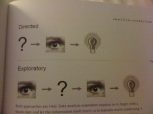
Stephen Few does a great job of explaining exploratory analysis with pictures:

where's the profit?
Exploratory Analysis

Half of the people reading this now understand the underpants gnome tie-in. For those who don’t get it, here’s a link to the original South Park clip (NSFW).

Jokes aside, I’m going to start with the picture, and discuss what this says to me about testing and see if it meshes with what JW’s definition of exploratory testing. I will then look at how this applies to visualization. At the end, the two will either come together or not. At this point, I’m not sure if they will. I’ll just have to keep exploring until I have an answer or a comment telling me why my answer is crap (which is fine with me if you have a good point).

Starting with the picture and testing. I’m assuming the “?” means “write tests.” The eyeball means analyze. The light bulb is the decision of pass or fail. The illustration of directed analysis looks like the process HP Quality Center assumes. QC assumes you’ve primarily written tests and test steps before testing based on written requirements. Then you test. After you’ve tested, you have an outcome.

The second line for “exploratory” analysis looks like a much more cognitive and iterative process. This says that the tester has the opportunity to interact with the system-under-test (SUT) before formulating any tests(eyeball). After playing with the SUT, the tester pokes it with a few tests (“?”). At this point the tester may decide some stuff works and keep poking or decide that some stuff has failed and write defects(light bulb.) Chapter 2 of Exploratory Testing describes how JW defines exploratory testing: “Testers may interact with the application in whatever way they want and use the information the application provides to react, change course and generally explore the application’s functionality without restraint (16).” So far this is looking very similar.

Now that I’ve looked at how the exploratory analysis paradigm applies to testing, here’s how it applies to visualization. As an example visualization, I’m looking at a New York Times graphic, How Different Groups Spend their Day. When I open this graphic, I can see that it’s interactive, so I immediately slide my mouse across the screen. I notice the tool tips. Reading these gets me started reading the labels and eventually the description at the top. Then I start clicking. The boxes on the top right act as a filter. There is a also a filter that engages when a particular layer is clicked.

Few’s point in describing directed analysis vs. exploratory analysis is that in the wild, when we look at visualizations, we use exploratory analysis. It’s not like I knew what I was going to see before I opened the visualization. Few describes the process known as “Schneiderman’s mantra” (for Ben Schneiderman of treemap fame) in more detail saying that we make an overall assessment (eyeball), take a few specific actions (“?”), then reassess (eyeball). Although Few doesn’t say that there is a decision made at some point in this process, I’m assuming there is because of the light bulb in the picture (84).

Recently, Stephen Few asked for industry examples of people using visualization to do their work. Some of the replies were from the airline industry, a mail order warehouse and a medical center. Software engineers should be included in this mix and apparently from page 130 in JW’s book showing a treemap of Vista code complexity, already are. Given that both use the same form of exploratory analysis, I can see why.

Exploratory analysis of software testing and visualization diverge, however, when you look at the scale of data for which each is effective. Visualization requires a large dataset. This could be multiple runs of a set of tests or, as in JW’s example, analysis of large amounts of source code. Exploratory testing as JW describes can occur at a high level such as in the case of a visualization or at the level of an individual test.

One thing my exercise has shown me for sure is that I have to read more of Exploratory Testing.