In this post, I will be answering the question, “what is data visualization” and writing about some of Edward Tufte’s principles of for “excellent” data visualizations. This can be an aid in creating better graphs or in looking at graphs. In a subsequent posts, I will relate these fundamental principals to visualizations for use in software testing.
In his first book, The Visual Display of Quantitative Information, Tufte outlines several principals for use in the creation and interpretation of quantitative graphics. If you get the chance, I highly recommend flipping through it. If you have questions about the statistics concepts, you might want to look at Head First Statistics
by Dawn Griffiths. I’ve been hitting this book up regularly especially for the metrics class I’m currently taking.
In the comments of my post “Exploring Data Visualization,” Eric asked me, “what is data visualization?” When I say data visualization I’m talking about a graphical depiction of statistical information that tells a story. These depictions can be simple or more complex, and they all have a point they are trying to make. According to Edward Tufte an excellent visualization expresses “complex ideas communicated with clarity, precision and efficiency,” (13).
To illustrate this have a look at one of my favorite interactive web graphics. “A Year of Heavy Losses,” from The New York Times. It illustrates the change in market capitalization of banks from 2007 to 2008. Be sure you click on the square at the top left to see the change. You can see not only the number of banks dwindling, but also their capitalization in the market. You can also mouse over each bank to see more granular data.
According to Tufte, these are some characteristics of excellent visualizations:
1. Lots of numbers packed into a tiny space
2. Data represented is not distorted
3. Extremely large data sets have coherency
4. Comparison between different pieces of data is easy
5. Data is revealed at a micro level and at a macro level
6. The data’s purpose is clear
7. Integration between the statistical and verbal descriptions of the data is tight
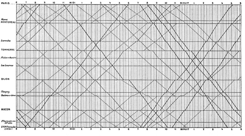
Here is an illustration Tufte uses as an example:

It is a French train schedule from the 1880’s. Take some time to look at it and understand it, then look back at the characteristics I have just listed. Did you notice how the cities on the left are not listed at regular intervals? This is because Marey spaced them apart proportionately to their actual distance from each other. Since he did that, when you look at the slope of the lines, you are not only seeing arrival and departure times, but also the relative speed with which the train will get you from one place or the next. If you depend on trains to get you from one place to the next, this can be very important information.
This graphic also illustrates the concept of multivariate data which, according to Tufte is also a quality of excellent visualizations. I’m going to break out what’s in the train illustration into univariate, bivariate and multivariate data. If I miss something, just add a comment.
Let’s start with the concept behind this illustration. It’s depicting arrival times and departure times of trains in France. It shows the route the trains take, and the relative speed with which they make from one station to the next.
Univariate data shows the frequency/probability of one variable.
Some univariate data from this graphic: the number of trains arriving or departing a station. The number of trains arriving at stations at any one time. The number of arrivals at a station each day. The number of departures from Chagny station each day. Each of the variables I have described is a frequency (Head First Statistics 609).
Bivariate data shows 2 values for an observation.
Bivariate data from this graphic:
(x) Time of day
(y) Number of trains arriving/departing at Chagny station
For this observation you need two variables(Head First Statistics 610).
Multivariate data shows multiple values for an observation.
If we take the observation from the bivariate data example and add stations, the observation becomes multivariate and is what you see in Marey’s illustration.
I’ve just covered a lot of material and I hope it gives you a good idea of what data visualization and the field of information visualization is all about. In my next post, I’ll be covering the ways in which graphs can lie. I’ve seen this happen at work and just completed a reading assignment for school where it was also an issue. These are complicated topics that software engineers should understand if they are to use visualization in ways such as a tester’s heads up display.
Questions and comments are always welcome.
![Reblog this post [with Zemanta]](http://img.zemanta.com/reblog_e.png?x-id=30f4b48c-9fd3-4627-be4f-3aeba03d11df)