Horizon Graphs for Code Churn

My advisor has asked that I do some posts as a journal for my software visualization work this semester. Some will hopefully come to fruition before the end of the semester. Do or die time, right?

The first idea that I’ve tweeted about, talked about, cannot shut up about is using a horizon graph to depict code churn. Currently, most of my work has centered around treemaps, but they have a weakness. They only depict one moment in time. Since code churn is concerned with the number of changes over time, a treemap will only show you code churn up to a certain moment in time.

This example horizon graph on Stephen Few’s blog shows the stock price performance for 50 stocks over 1 years. An increase in color saturation indicates an increase up or down. The hue indicates whether the change is positive (blue) or negative (red).

Although the example is from Panopticon, I’m confident that Processing could produce similar results. The idea is really genius, and says very good things about Panopticon. I starred this a while ago in reader. Recently, Alan Page turned me on to some papers by an expert at Microsoft, Dr. Nachi Nagappan. I’ve been rooting around in some of them and noticed that code churn is mentioned again and again. I also noticed that he’s frequently working with millions of lines of code. I don’t know how many components that adds up to, but I’d like to see if the horizon graph would still be useful with hundreds of components, or if it would overwhelm the viewer.

If we’re going for a t.h.u.d, I think you’d have the treemap for upper levels in a hierarchy of components. If the user wanted to investigate an area more there would be a click through to something like the horizon graph.

And the Winner is…

My last semester of school ever has begun. For the past few months I’ve been going back and forth about what I would study. I wrote a previous post about some of my options. The school I attend is very application based. There’s not a lot of research going on and most people just want the piece of paper. No one here expects a fancy internship at Microsoft or Google. Those recruiters have yet to show up on our campus. Students at Southern Poly just want their resume to look good. This means that the majority of people here focus on acronyms.

In looking around for a topic, I initially looked at holes in my skillset and the acronyms involved. I’m not that great with xml, css or xslt. I haven’t worked with SOAP, REST or LAMP. Although my thesis is about data visualization for software quality, I was telling myself that my thesis work should be enough “fun stuff” for me to be satisfied. Then I remembered how my parents relentlessly convinced me that a career should not be fun.

As a high school student, I was obsessed with a career in technical theater. I loved the design and build of sets. To me it was the creation of a new world within the limited space of a stage. There are just as many theater classes on my high school transcript as math classes, and I was committed to finding a great theater program for college.

To say that my parents were not encouraging is an understatement. They were so pissed off! Oh, the screams! For them, the only real jobs were the ones listed in the classified section of the Sunday paper. “Show us a ‘want ad’ for set designer,” was their common refrain. I heard this over and over for months in the living room, in the car on my way to freshman year in college, on the phone when I was at school. Eventually, they repeated this often enough that I became discouraged and dropped out of the theater program at Appalachian State.

Last week, it was finally time to put my intentions for this final semester into the system. As the acronyms were cycling through my head, I reflected on this whole show-me-the-want-ad mentality, and realized that I was in a similar situation with my last semester. I’ve got all the practical, resume-enhancing choices behind Door #1 and the topic with no want-ad attached, data and software visualization, behind Door #2. I can just see the indignation on my parent’s faces.

This is how I know, absolutely, that Data Visualization is the RIGHT choice. My thesis advisor (bless him!) helped me put a curriculum together for a survey of data visualization with a focus on software. I feel like I’ve gone back in time and re-traced my own steps. It’s like I’ve gotten a big, fat do-over as my SPSU swan song. The new Stephen Few book, Now You See It: Simple Visualization Techniques for Quantitative Analysisis my textbook along with Software Visualization: Visualizing the Structure, Behaviour, and Evolution of Software..

Even if I never have another job where I use this, even if I have to keep it as a hobby forever, it’s priceless to me that I will have the time and faculty support to broaden my expertise in this area. I have the rest of my life to learn “REST.” The important acronyms seem to change after 3-5 years anyway. At this point, I know that Data Visualization is not going anywhere. That might actually make it the most practical even though there’s no want-ad for data visualization specialist in the paper.

BTW, my parents eventually realized the damage they had done when I ended up an overqualified (and miserable) secretary. It took a few wayward years and another college degree, but I finally realized that sometimes it is necessary to ignore your parents.

Training without a Net

Trapeze School New York Beantown at Jordan's F...
Image by StarrGazr via Flickr

Those of us who like to be actively involved in the meetings we attend surely notice the effect a giant flat screen presentation has on meeting conversation.  It can be stultifying.  In the case of training, the presence of slides on a flat screen is the equivalent of showing a really bad talk show like Jerry Springer.  Nobody learns or remembers anything unless there is a fight or petty squabble.

This week I had to train some of our system’s users on how to write usable bug reports.  I had an outline and an example that I thought was interesting enough to keep people awake and focused on the topic. In order to make the information stick, I decided to go without slides, and see what it got me.

Preparation
You would think there would be less to prepare, but in truth, you have to come up with something that will keep your audience occupied.  In my case, I put together a group exercise by creating a scenario involving a bug.

Tip #1: don’t create a trivial scenario

My scenario was too far removed from our daily situation to ring true.  I could tell that some of the users felt I was wasting their time by having them work with an example they felt was “too simple.”  Once I noticed this, I threw it out and said, “let’s just talk in terms of our system.”  This seemed to make people more comfortable.

Tip #2: have an outline IN REALLY BIG LETTERS
Chris McMahon suggested this over twitter (thx!) and it did help.  The only problem with my outline, is that I couldn’t see it very well without picking it up.  There wasn’t much on it anyway so if I could have easily enlarged the font.

Keeping Your Audience Awake
Chris also suggested that I move around and stay animated. Since I have natural talent as a drama queen, this is typically not a problem for me, but is worth a mention. Raise your hand if you’ve seen a speaker able to put you to sleep merely with the narcoleptic power of their voice. There are also speakers who mumble in which case you won’t be able to understand what they are saying even if their voice keeps you awake because its “nails on a blackboard.” In that case, maybe you really do need the slides. Am I getting too off-topic with this?

Keeping the Focus on Topic
Once the flat screen has been removed, you will find that people have stuff they want to get off of their chest.  If you are the only person holding meetings without slides:  Guess what?   They will choose your meeting to unload.  I noticed people communicating more about our defect process than I had anticipated, and not necessarily in ways that I had planned.

Tip #3 Be flexible and open to some change in the agenda
Mid-way through our exercise, we had chucked my example and were discussing the pieces of our system that should be documented in describing the environment of a crash.  The users were talking to developers about the challenges they have in reporting their environment and I noticed some holes in our defect process. We were still on topic, but I let the users talk to us about what they typically see when they have problems running the system.

Tip #4  Don’t let meeting participants change your whole agenda
Since people were talking to each other and sharing information about our software process, the discussion was pretty intense.  I found myself circling back to my outline a number of times.  Some discussion was worthwhile, but obviously needed to happen in a separate meeting.  Sometimes attendees will resist moving on, but I find that a quick, “we’ll schedule another meeting, moving on to <next point goes here>…” will get the job done.

Would I do this again?
Absolutely.  Even though I write about and study visualization, there are times when we really do need to sit in a circle with the talking stick and communicate with each other.  In fact, even Prof. Edward Tufte recognizes that there’s no need to have the monitor on all the time.  In his lectures, he shows you the graphic, tells you what to look at and then TURNS IT OFF.

Training without slides is not for the faint of heart, but, in the end, I think my work colleagues respected the fact that I wanted them thinking through the material and not just gaping at a flat screen.

Reblog this post [with Zemanta]

Plagues aren’t just for blog posts

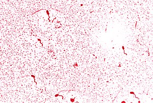
Vibrio cholerae with a Leifson flagella stain ...
Image via Wikipedia

For the past couple of months, James Whittaker has been writing about the “plagues of testing.” As he’s been posting, I’ve been reading through a book about a real plague.

As software testers, we see a system from a perspective that developers and business types rarely and may never see.  We know our tests, we know how well they ran.  We know our system under test and which components are picky.  If you are like me, and have access to the code base, you also know the code.  In the case of both the system and it’s code you know what should be better.  Sometimes this is not a big deal, but sometimes it is a warning that it’s time to polish the resume. I have not seen this, personally, but I know that there are testers who find themselves in this position.

John Snow was a doctor in this position. He was an expert in the new art of anesthesiology in 1850’s London. He was also deeply involved in the study of cholera and concluded that it was a water born illness. This was very much counter to the prevailing theory of the time that cholera was passed through a sheer volume of stench or miasma (I can hear Dr. Evil saying this word). Health authorities in London, were so convinced that miasma, or extreme smellyness, was the reason for disease that they passed a law in 1848 requiring Londoners to drain their waste into a sewage system that would deposit into the Thames river. Unfortunately, the Thames was also a main source of drinking water for the city. Snow knew all of this and could see a health crisis in the making.

In 1854 when a major outbreak of cholera erupted in a neighborhood very close to where Snow lived, he conducted a thorough investigation in order to prove this theory that cholera was passed through water. He had a list that detailed the names and addresses of 83 people who had died from cholera.  He also had an invaluable resource of detailed information about the neighborhood’s residents in the form of local clergyman Henry Whitehead.  While Whitehead tracked down and questioned everyone he possibly could about their drinking habits, Snow analyzed this data to form patterns of who had been drinking the water, who had died and, just as importantly, who had NOT died.  Not only were Snow and Whitehead able to convince the local parish board to remove the handle of a contaminated water pump, they knew their data so well that they were able to figure out the index, or original, case that had started the outbreak.

John Snow Map

After the outbreak had subsided, Snow put the analysis from his investigation together with a very famous map into a monograph that circulated among London’s health professionals.  His monograph slowly but effectively turned the tide of thinking among health professionals away from the miasma theory.  This and a very smelly Thames convinced authorities to build a new sewer system that drained into the sea.

Frequently, when I talk to people about data visualization, they always ask me how I know what to visualize.  The Ghost Map, by Steven Johnson, illustrates this perfectly.  John Snow went from having a theory to proving his theory with visualization in a convincing way.  There’s no wizard or easy-button for this one.  It takes knowing what you are trying to say and knowing the data, inside and out, you are using to prove your theory.  For testers, this means digging into test runs and testcase organization.  Where are the tests that failed?  How many times did they fail? How are they grouped together?  Does an object that make 1 test fail make others fail as well?  If you know which tests are failing, what do you know about the code you were excercising?  How complex is it?  I know this awful, but I would so go here if I thought it made a difference…who coded it and do I respect their coding talent? Even if I think they are solid, did they know what they were supposed to be doing? You have to know exactly why you are telling the PM you think there is a serious problem and have a way to show it. I lump business people in with having the same short attention span as doctors and politicians. My blog post probably lost them at “James Whittaker.”

Johnson and Whitehead could not drag the dead people’s relatives in front of London’s public health community and force the doctors to listen.  These days doctor’s short attention span is because of insurance, but I’m sure there were other reasons back in the day.  A good visualization does not take a long time for the viewer to process.  That is their special power.  Snow’s map is much more concise than a table of 83 names and addresses along with their individual stories.  Visualization can quickly show your groups of tests that are failing.  It can show that severe defects are increasing, and not decreasing, over time.  Business may drive the ship/do not ship decision, but a good tester will know why a seriously ailing system is in so much trouble.  A great tester can effectively communicate this to a business team.

Reblog this post [with Zemanta]

A Very Knotty Past

Camping at Moran State ParkAdam Goucher does not have the first clue about the can of worms he opened at our much blogged Tuesday night supper meeting. I’m not even talking about Adam’s volunteering my friend and I as founders for the Atlanta Testers Club (currently 2 members). As we settled into our dinner discussion, he was talking about some of the people he knows in the testing community, one of whom is James Bach.

Those of you who know Mr. Bach are probably assuming that this post is going to be a test “discussion.” Nothing could be further from the truth, in fact, this is not a testing post. Adam casually mentioned that Mr. Bach lives on Orcas Island. His mention was something like, “and he lives on Orcas Island, if you’ve ever heard of it.” Have I ever heard of Orcas Island? Indeed, I have. The macro version of my story is that my husband and I camped out on Orcas for several days a couple of years ago (maybe it was this week). The micro story is a tale that shows how some places can unlock our imagination in ways that might not catch up with us for days, months or even years.

I’ve blogged previously about my tendancy towards art. Drawing and painting are with me even if I’ve consicously decided to put it into a box not to be opened until I’m finished with some career goal or degree. When I finished my CS undergrad, I was very happy to go back to art. I learned the ins and outs of drawing Celtic Knots with Cari Buziak. I made gifts for my Grandma and had a great time obsessing over the geometry of very tiny lines.

Then I took a job in Configuration Management. Those of you who have worked in CM or have had to work closely with production releases know exactly how loaded a phrase that is. I was shoved in a basement and given a schedule with absolutely no regularity at all. They gave me a very old laptop so that I could get up at all kinds of hours and work. There’s no support at these hours, so if something went wrong, I had the choice of waking someone up or figuring it out and fixing it myself. I opted for the latter whenever possible. My extra time became devoted to sleep and the art faded into the gray light of the daysleeper I became.

At least I still had vacation. My husband and I visit the Pacific Northwest whenever for possible, and the National Speleological Society (cavers) had their annual convention in Bellingham, Wa. Since my CM job and Chris’s Fire & Rescue job didn’t pay much, we figured out that if we wanted to stay longer, we needed to camp out. We looked for state parks that took online reservations and ended up camping out at Moran State Park on Orcas Island for most of a week. There’s really not much to do there except for hiking, concerning oneself with the tending of a campfire or watching the trees. With this rest and relaxation, my brain finally began unlocking itself from the knots induced by production builds. These knots ended up on pages in my journal as drawings. The art came back! I felt like Kyle MacLachlan in Dune.

See that girl...don't mess with her.  She hasn't been sleeping.

We left Orcas the same way we arrived, by ferry. During the Summer, there are always long lines for ferries in the San Juan Islands. As I waited, I drew a spiral from one of my Celtic drawing books. I don’t know what it is about that place that opened me up in such a big way. The water was a mirror showing me qualities about myself that I had been ignoring, much to my detriment. When we got back to the ATL, I had a tattoo artist tattoo the spiral on my leg and I signed up for a spirals class with Cari. The art never goes away and Orcas Island is with me, permanently.

A Spiral of Birds
Since Adam mentioned Orcas Island, the knots and spirals have returned, but I’m thinking of them in a completely different way than I did before. They have something to teach us about interaction and visualization…

hey lady, where’d you get that treemap?

If you’re on twitter and feel as though you are “muddling through” like I feel most of the time, you’ll understand what a gift it is when someone sends you a really cool tweet.  Here’s the one I got today from @shelkster:

“What Processing code did you use for the treemap? Been exploring various examples. This is a great use of the strip treemap.”

Well, first of all, thanks!  Second of all, I have a confession to make.  The treemap itself is not from Processing. It’s from Treemap 4.1 which is software created at the University of Maryland in their HCIL lab.  What I did write in the Processing IDE was the code that parsed out all of the values. This would have been slightly easier had I just done it Eclipse, but for some reason, I was very curious about using the Processing IDE for this task.  There’s 99% chance I’ll be moving that from Processing into a Java class.

A few weeks ago, I worked through the treemap chapter in Ben Fry’s Visualizing Data“>Visualizing Data and came up with this map of the files on my computer.  (Keep clicking and you’ll get a good view of it)

Processing Treemap of My Files

This one is squarified and has the style of this treemap of the news. So if you have that book, Visualizing Data, this is where you will end up.  The reason I have initally chucked the data into Treemap 4.1 instead of the processing treemap has to do with the data format and configurability.  Treemap 4.1 uses the tm3 format which is basically a tab delimited file.  Ben Fry’s treemap example is “processing” files using java’s ability to search through a file system.  Treemap 4.1 also allows an exploration of data through its user interface.

My post, at this point, might sound like an ad for Treemap 4.1, but I’d like to point out, that it’s only supposed to be used for research and not for commercial purposes.  Maryland’s HCIL lab seems connected to a business group that sells this type of software for extremely large sums of money that I certainly can’t afford.  The tests that I visualized are from Mozilla, and I used this as part of my thesis work. If it weren’t for the ability to configure the treemap from the user interface, I wouldn’t have used Treemap 4.1, I would have used JTreemap. From twittering with the writer @benoitx, I know that it is still being maintained. If you just want to see data in a treemap and want it to be as simple as possible, this is a good choice.

Since I now have the data file I need, my next step is using the Treemap api released under the Mozilla public license to render the Mozilla tests in Processing’s treemap.   I think I remember from my previous digging around, that it supports several layouts including strip.

Probably more than you wanted to know, but uh…it’s my blog.  And thanks for the tweet. It really made my day.

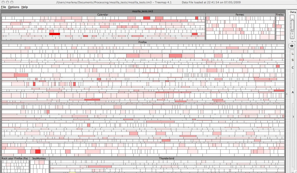
What Do 3859 Tests Look Like?

Mozilla Tests in a Treemap

Yes, that really is 3859 tests in a treemap.  The size of each square represents the number of tests and the color represents the number of failures out of 1 -15 tests.  I used the strip layout to preserve order which means that anyware you see a cluster of red indicates consecutive tests with several failures.

There’s much room for improvement with this one, but the complexity of wrangling this data into the tm3 format forced me to make compromises.  For starters, the hierarchy is missing a layer.  I had to leave it out because it would have duplicated tests, and I wasn’t sure how I felt about that.  Although the number of failed tests does show tests that have had more failing runs, what it doesn’t show is how these tests are grouped by OS.  I want to see failures grouped by OS, and plan to work on this.  Instead of showing number of failed tests, I think it would be more truthful to show a failure rate.  That is, given the number of test runs for that test, what is the percentage of fails.

It’s late, and the Art Wolfe show has finished on PBS.  Oh crap, it’s Sherlock Holmes with Jeremy Brett.  I think Jeremy Brett is awesome.  If I don’t go to bed now, I’ll be up ’til 12.  Please forgive any crazyness in my post this time.  I’m just a little giddy about actually seeing this.

Test Patterns

This will be the next-to-last week of my design patterns class, and I’m working on my final project. We were told to pick some category of design pattern and to do write-ups of the patterns in our category. Some of the example categories were security patterns, anti-patterns and concurrency patterns. I chose test patterns so it would be reusable for work.

So far, what I’ve found is that “test pattern” can mean just about anything in testing. In fact, I question whether there is really a difference between “test heuristic” and “test pattern.” It’s all just ways of categorizing abstract testing concepts that can reapplied in difference scenarios, right?

I looked up test patterns in How We Test Software at Microsoft who have also defined some of their own test patterns. In HWTSM they pretty much refer the reader to a great, fat, brick of a book titled, Testing Object-Oriented Systems by Robert Binder. I know that this book is a brick because I’ve purchased it and have been losing weight by carrying it around when I’m not reading through it. (Maybe Oprah should try this.)

This book not only has test patterns, but categorizes the test patterns into several chapters. Included are Results-Oriented Test Strategy, Classes, Reusable Components, Subsystems, Integration, Application Systems and Regression Testing. As an example, the Integration chapter contains the patterns Big-Bang Integration, Bottom-Up Integration, Top-down Integration, Collaboration Integration, Client/Server Integration, and a few more.

As I’ve been schlepping through this huge book, I’ve noticed just how technical and detailed it is. This leads to my next question, how many people use test patterns knowingly as test patterns? It’s not like most of us in testing trained for this, and the only place I’ve found straight up definitions of test patterns aside from the microsoft post is in this particular book. When I use Quality Center, it’s not like I’m separating out my tests by pattern or heuristic. Should I be? I’ve also read of testers who felt that their success was due to the fact that they weren’t following a pattern, but acting as a user. But then, isn’t that a pattern too?

I’ll post some of the stuff I’ve done for this project in a week or so. Very interested in what people think about using test patterns for testing.

Reblog this post [with Zemanta]

Concurrency,Picture Pages or Foxy Tests

This Fall will be my last semester of graduate school. Wow, I can’t believe I said that.

For my last semester, I’m already signed up to finish my thesis. I also have a completely, wide-open, elective to take. My advisor has cleared the way for me to take an independant study. This puts me in the freaking awesome position of putting together an independant study for any topic in the realm of Software Engineering/Computer Science that I want. Woo-hoo!

These are the topics I am considering:

Advanced Distributed Systems: Concurrency, Threads and The role of XML in web apis such as LAMP, SOAP, etc. I know the very basics of XML and I’ve seen it implemented (in the most horrible way conceivable). I’ve never written code using much XML, and I don’t like that. I only see more xml in the future, not less, and lately, this html parsing thing has really been kicking my butt. If I don’t learn about this at school, I’ll be addressing it separately afterward. Concurrency is, I think, one of the most underestimated topics in computing today, and I’d like to take a closer look at it. I’d especially like to do some more work with a functional programming language. I did some Erlang a while ago and it has drastically changed the way I think when I’m coding.

Survey of Data Visualization: I would do a lot of writing about different topics in visualization including some history. This would include using different tools for Visualization. Aside from Processing, I’ve been working with Flash and Illustrator (freaking sweet software, that). I know there’s a javascript library for visualization. I’ve already done some nice work with visualization, but it would be great to have the type of rock solid foundation that this would give me.

Web Browser Based Software Testing: All of the testing I do is for apps that have a command line interface. I read David Burns’s, aka the Automated Tester’s, blog and tweets feeling very envious of all the fun stuff he gets to do. I’ve also never done performance testing, and would really like to take a crack at it. If I choose this topic, I would definitely roll in some study of virtualization.

At this point in time, I’m not really sure which of these three topics I’ll choose. They all address areas of technology that I feel are highly important . Whichever topic I choose, I will be blogging most of my work.

I feel grateful that the teachers in my school trust me enough and are open enough to give me this opportunity of independent study. My school, Southern Polytechnic State University, might not have the resources of a top tier school, but all of the teachers I’ve encountered have gone out of their way to help me achieve goals that I set for myself. I’m not sure I would have been given this freedom at another school. The school that allows a motivated learner to chase their dreams in a responsible way is to be commended. I’m not a “school spirit,” cheerleader-y type, but I might actually purchase a class ring this time. It would definitely be silver and have either a black or amethyst stone to match my Doc Martens and black hair.

How we read


View Larger MapRecently, I tweeted about reading Steven Johnson’s book, The Ghost Map.  It’s a book that ties in with my PNSQC paper in a very odd way which I’ll write about later.  What I noticed as I was reading, is that the way I read has changed.  The Ghost Map is about a cholera outbreak in London during late August/early September of 1854.

Even though I’m only 1/5 through the book, I’ve already looked up all of the places on Google street view.  This is a new and an old thing for me.  Whenever I’ve read books about a certain location, the next step, for me has always been to find a map of the location and take a good look.  This time, not only can I see the layout of the streets, but I can see what they look like “on the ground.”  Johnson writes about how crowded the streets are and about the dense population of the area.  If you look at streetview, this is immediately noticeable.

Although my copy of this is book is a dead-tree copy, I have to wonder how my experience would change if I had an e-Reader.  With the current paradigm shift taking place from dead-tree books to e-readers, I expect that books themselves will change and will allow the reader different ways to explore their content.  This, in turn, will create different expectations from those who are reading.  I won’t be going from my dead-tree book to my computer to look at the Soho area of London.

Some of you may have used Zemanta for blogging.  Zemanta sits next to the window where I write text in my blog and makes suggestions for pictures and links while I type.   Although, at this point in time, I use Zemanta for writing, I can see a Zemanta like integration for reading as well.  One of the first chapters in The Ghost Map describes clergyman Henry Whitehead making his rounds through the neighborhood.  I’d love to see a map next to the text that I am reading which shows the route he is taking or pictures of some of the places he is visiting.

Language is its own art form.  You can’t just replace a book with a bunch of pictures and links, but there is more than one way to explore writing.  The best writers, I believe, will find ways to integrate the language of their writing with the exploratory journeys their readers take.

Have you noticed differences in the way you read?  How do you think reading will change as we move from paper to e-readers?  If so, I’m very interested in hearing about it.